- 데이터 시각화는 예쁜 그림에 머물러서는 안 된다고 생각합니다.
- 데이터 분석의 일환인 만큼 분석의 목적에 충실해야 하는 것은 물론이고,
- 데이터 시각화를 수행하는 사람만큼 데이터를 깊이 파는 사람이 없습니다.
- 최고의 조언자로서의 데이터 시각화에 도전해봅니다.
1. 데이터
Pega Devlog: 수능 Trend Visualization
한국교육과정평가원 대학수학능력시험 정보
국가통계포털
-
수능 데이터를 가지고 시각화를 수행한 적이 있습니다.
-
여기에 인구 데이터를 얹어서 출생아 수와의 연관성을 그려봅시다.
-
데이터는 여기서 다운받을 수 있습니다.
-
이 데이터를 추세를 보여달라는 요청에 따라 시각화했다고 가정했습니다.
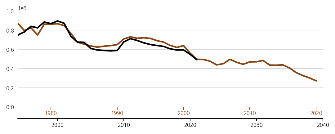
2. 시각화 결과물
-
결과 그림을 먼저 보여드리고, 제 생각의 과정을 나중에 말씀드리겠습니다.
-
시각화 목적은 저출산 추세를 반영한 20년 뒤 대학 등 교육 정책 수립으로 가정했습니다.
-
단순하게 년도별 출산률과 수능 지원자 수를 나열하고 싶지 않았습니다.
-
선명한 메시지를 도출해서 적극적으로 전달하고자 했습니다.
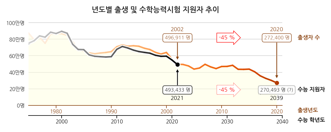
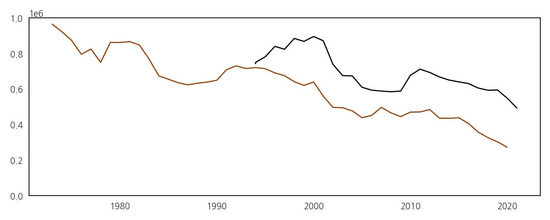
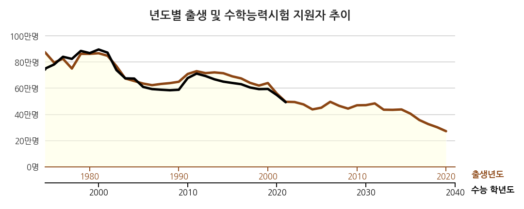
2.1. 시각화 결과물 (1) - 요청에 충실
-
추세를 보여달라는 요청에 충실한 결과물일 것입니다.
-
출생년도와 이 해에 태어난 학생들이 수능을 치르는 학년도를 겹쳐서 비교하기 편하게 그렸습니다.
-
그림 뿐 아니라 x축도 어긋나게 겹쳐 한눈에 보이고자 하였습니다.
-
가장 최근의 실제 데이터는 2002년도에 태어난 학생들이 치른 2021학년도 수능입니다.
-
이 데이터와 2021년 출산 데이터를 바탕으로 2039학년도 지원자를 예측했습니다.
-
지원자 45% 감소라는 충격적인 결론입니다.
-
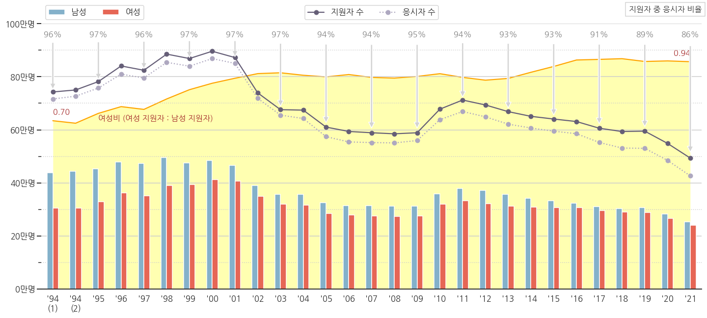
그런데 조금 이상합니다.
-
“태어난 학생 전체가 수능을 본다고?”라는 합리적 의심이 가능합니다.
-
심지어 과거엔 태어난 학생보다 더 많이 수능을 보기도 했습니다.
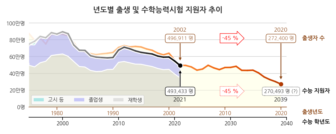
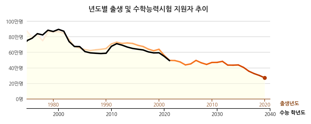
2.2. 시각화 결과물 (2) - 의구심 해소
-
수능 데이터에 포함된 그룹별 데이터를 함께 표시했습니다.
-
재수생을 비롯한 졸업생 비중이 상당하고, 재학생(고3)은 80%가 채 되지 않습니다.
-
저 재학생 중 일부가 졸업생으로 다시 수능을 치릅니다. 이제 이해됩니다.
-
의구심은 해소됐지만 시각화의 목적은 이게 아닐겁니다.
-
앞으로 교육 정책을 어쩔거냐를 생각할 때 과거보다 미래가 중요합니다.
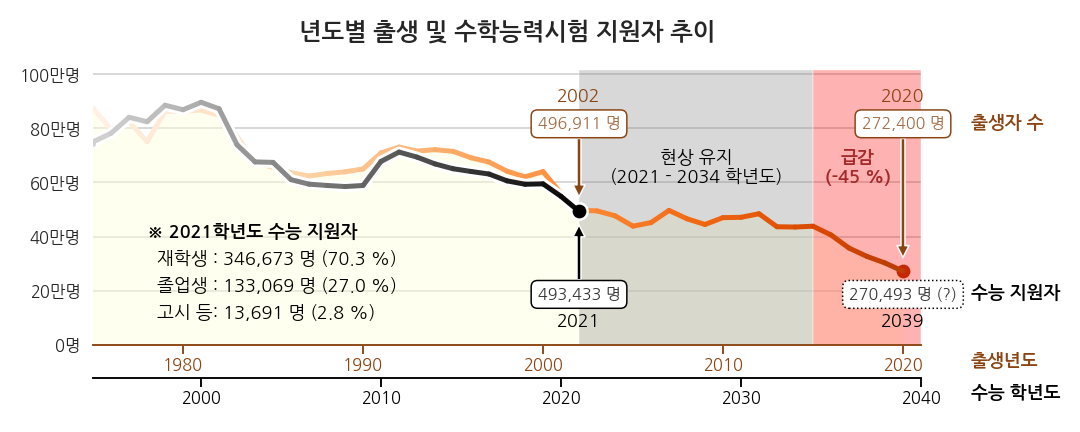
2.3. 시각화 결과물 (3) - 메시지 전달
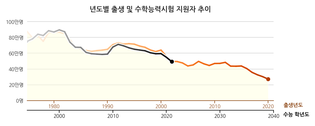
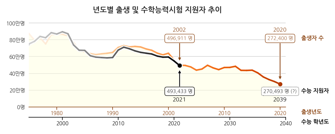
-
지원자 비중은 2021년 것만 텍스트로 표기했습니다.
-
“이게 말이 돼?”라는 의구심에 대한 대응으로 충분합니다.
-
과거 의 지원자 비중 변화 추세까지 전달할 필요는 없기 때문입니다.
-
향후 추세에 집중했습니다.
-
과거의 패턴으로부터 수능 지원자 수 변동은 출생자 수와 밀접한 연관이 있습니다.
-
앞으로도 그렇다고 봤을 때, 2034년까지는 현 수준을 오르내릴 것입니다.
-
문제는 그 뒤입니다. 5년간 45%가량 급감합니다.
-
14년 뒤가 진짜 위기이니 그 전에 미리 잘 준비하세요라는 의미를 담고자 했습니다.
-
현상 유지 구간은 불편한 느낌이 들도록 회색을 깔고
-
급락 구간은 위기감을 느끼도록 붉은색을 깔았습니다.
-
텍스트를 노랗게 해봤지만 빨강이 더 위태로워보여 주의력을 일부 희생했습니다.
3. 시각화 코드
- 시각화 단계별로 코드를 공개합니다.
- 첫 코드는 17줄, 마지막 코드는 165줄입니다.
3.1. 시각화 세팅
- pandas로 읽고 matplotlib으로 그렸습니다.
- seaborn은 기본 설정에만 사용했습니다.
1 | %matplotlib inline |
- 데이터 확인 부분은 생략합니다.
- 직접 해보시면 좋을 것 같습니다.
3.2. 데이터 확인
- 여러 컬럼 중 가장 중요한 년도, 출생아 수, 수능 지원자 수만 그립니다.
코드 보기/접기
1 | fig, ax = plt.subplots(figsize=(15, 6), facecolor="w") |
3.3. spines 정리, grid 추가, 선 굵게
- 불필요한 구성요소를 모두 제거합니다.
- 출생은 진한 갈색
saddlebrown, - 수능은 검정
k으로 통일합니다.
코드 보기/접기
1 | fig, ax = plt.subplots(figsize=(15, 6), facecolor="w") |
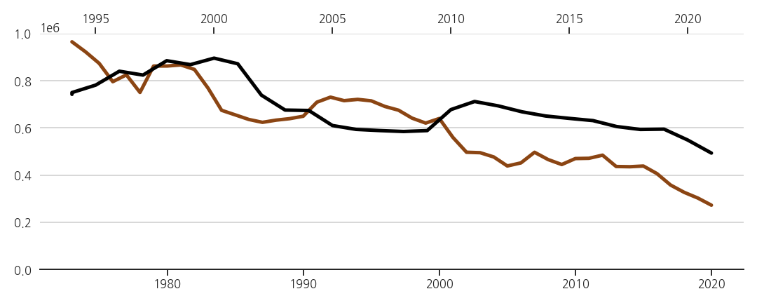
3.4. x축 눈금 중첩 준비
-
두 데이터가 19년의 시차를 두고 형태가 비슷합니다.
-
기왕이면 겹쳐서 연관성을 더 명확히 보여주면 좋겠습니다.
-
x축도 가까이 놓고 19년 시차를 한눈에 보여줄 준비를 합니다.
-
ax_sn = ax.twiny()로 y축을 공유하는 복제 axes를 만듭니다. -
수능 데이터는 여기에 다 몰아서 표시합니다.
-
이 axes(ax_sn)도 불필요한 요소를 모두 지웁니다.
코드 보기/접기
1 | fig, ax = plt.subplots(figsize=(15, 6), facecolor="w") |
- 처음에는 유사한 matplotlib 예제를 적용하려고 했습니다.
- 그런데 왠지
hostaxes는spines[].set_visible(False)가 적용되지 않습니다. - 확인해보면 적용은 되었다고 나오는데 여전히 시야에 보여서 방법을 바꾼 것입니다.
3.5. x축 눈금 설정 완료
- 위에 올라붙은 수능 axes(ax_sn)를 아래로 내립니다.
- 구분하기 좋도록 두 spines와 ticks, ticklabels를 각자의 색으로 칠합니다.
- 19년을 옮겨 범위까지 맞춰주면 연관성이 명확히 드러납니다.
코드 보기/접기
1 | fig, ax = plt.subplots(figsize=(15, 6), facecolor="w") |
3.6. yticklabels, xlabels, title, 색칠
- x축 제목을 붙입니다.
- x축 눈금 아래에 붙이는 것이 일반적이지만, 우리 그림에서는 공간이 없습니다.
- x축 오른쪽에 붙입시다. 출생은 출생 색, 수능은 수능 색으로요.
- 출생자 수 아래엔 연한 노란색을 칠하고 y축 눈금도 붙입니다.
코드 보기/접기
1 | fig, ax = plt.subplots(figsize=(15, 6), facecolor="w") |
3.7. 시간의 흐름 강조 1: 출생 추세 그레이디언트 적용
-
정지된 그림의 최대 단점은 변화를 담기가 어렵다는 점입니다.
-
그럼에도 불구하고 시간이 흐르는 모습을 표현하겠습니다.
-
가장 고전적인 방법은 화살표를 사용하는 것이지만 촌스럽게 느껴집니다.
-
최근 연구에 따르면 화살표보다 그레이디언트가 더 효과적으로 움직임을 전달한다고 합니다.
-
구체적으로는 시신경의 반응량이 더 많다고 합니다.
-
matplotlib에서 line plot에 그레이디언트를 표현하는 방법은,
-
짧은 도막으로 나누고 각각을 다른 색으로 칠하는 것입니다.
-
순차적으로 변하는 색상은 colormap에서 가져오면 됩니다.
-
맨 마지막에는 동그라미를 달아서 머리를 알려줍니다.
-
변화에 대한 인지능력이 향상됩니다.
코드 보기/접기
1 | from matplotlib import cm |
3.8. 시간의 흐름 강조 2: 수능 추세 그레이디언트 적용
-
같은 기법을 수능 데이터에도 적용합니다.
-
그런데 그냥 그리면 출생 데이터와 너무 겹쳐 깨끗해보이지 않습니다.
-
수능 데이터에 하얀 윤곽선을 달아줍니다.
-
조금 굵은 선을 밑에 깔아주면 쉽게 그릴 수 있습니다.
-
하나 더, 적용한 컬러맵(Greys)은 끝 지점이 흰색입니다.
-
line plot에 흰색이 들어가면 알아보기 힘들게 됩니다.
-
기준점을 조정해 흰색이 보이지 않게 합니다.
코드 보기/접기
1 | from matplotlib import cm |
3.9. 2002년과 2020년 출생자, 2021학년도와 2039학년도 수능 지원자
- 명확한 전달을 위해 데이터를 숫자로 표기합니다.
ax.annotate()와ax.text()를 함께 사용합니다.bbox=파라미터로 배경에 모서리가 둥근 사각형을 배치해서 잘 띄이게 합니다.- 범례(legend)를 따로 달지 않습니다.
- 데이터 옆에 굵은 글씨로 데이터 이름을 적어줍니다.
코드 보기/접기
1 | from matplotlib import cm |
3.10. ver 1. 감소량을 표시합니다.
ax.text()는 화살표 안에 글자를 담을 수 있습니다.- -45%라는 감소량을 강조합니다.
코드 보기/접기
1 | from matplotlib import cm |
3.11. ver 2. 구성요소를 표시합니다.
- "죄다 수능을 본다고?"라는 의문에 대한 답을 미리 제시합니다.
ax.fill_between()으로 영역을 칠하고, 구석에 범례를 삽입합니다.
코드 보기/접기
1 | from matplotlib import cm |
3.12. ver.3. 메시지 전달력 강화
- 데이터를 들여다보면서 찾은 메시지를 담습니다.
- 미래를 두 구간으로 나누고 각기 의미를 담습니다.
코드 보기/접기
1 | from matplotlib import cm |
4. 소스 코드
- 위 코드와 그림이 담긴 노트북은 여기에서 다운로드 받으실 수 있습니다.
