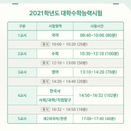
- 대학수학능력시험은 94학번 이후 대학 진학을 결정하는 시험입니다.
- 얼마 전에 끝난 2021학년도 수능을 포함해 29회의 수능이 있었습니다.
- 근 30년간 응시생과 점수에 대한 트렌드를 확인해 보겠습니다.
1. 데이터
1.1. 데이터 확보
- 수학능력시험 관련 데이터는 공공데이터 포털에서 다운받을 수 있습니다.
- 여러 데이터가 hwp와 csv 형태로 주어집니다.
- 이를 정리하고, 파이썬에서 활용하기 쉽도록 컬럼명을 영문으로 바꿉니다.
[파일 다운로드]
- 학년도 : year
- 지원자 수 : num_total
- 남성 지원자 수 : num_M
- 여성 지원자 수 : num_F
- 재학생 : cat_go3
- 졸업생 : cat_grad
- 검정 등 : cat_ged
- 응시자 수 : num_test
- 평균점수 (전체) : score_avg
- 평균점수 (남성) : score_avg_M
- 평균점수 (여성) : score_avg_F
- 평균점수 (재학생) : score_avg_go3
- 평균점수 (졸업생) : score_avg_grad
- 평균점수 (전체 상위 50%) : score_t50_avg
- 평균점수 (남성 상위 50%) : score_t50_avg_M
- 평균점수 (여성 상위 50%) : score_t50_avg_F
- 평균점수 (재학생 상위 50%) : score_t50_avg_go3
- 평균점수 (졸업생 상위 50%) : score_t50_avg_go3
1.2. 데이터 확인
- 주피터 노트북에서 데이터를 불러옵니다.
1 | import pandas as pd |
- 데이터가 모두 온전한지도 봅니다.
1 | df_sn.info() |
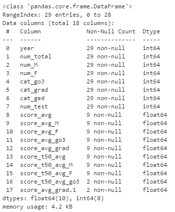
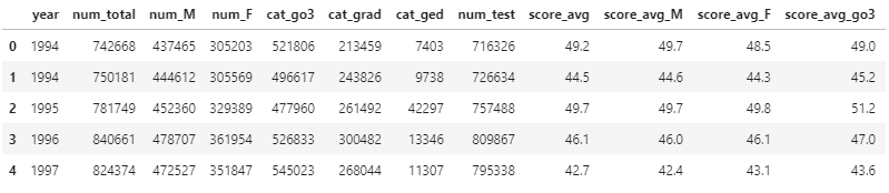
- 점수 데이터 부분에 결측치가 상당합니다.
- 재학생과 졸업생의 상위 50% 점수는 단 두 건입니다
- 이건 그리지 맙시다.
- 29번의 수능 중 9번만 점수 데이터가 있습니다.
- 2002학년도부터 총점을 공개하지 않고 표준점수 등으로 변환해서 공개한 결과입니다.
- 동일 기준으로 분석하기 어려워 점수 분석은 94~01까지만 합니다.
- 재학생과 졸업생의 상위 50% 점수는 단 두 건입니다
2. 데이터 시각화
2.1. 시각화 준비
- matplotlib을 비롯한 라이브러리들을 불러옵니다.
- 한글을 사용할 것이므로 한글 설정도 합니다.
1 | %matplotlib inline |
2.2. 시각화 색상 선정
T. Toivainen et al., Sci. Reports 8 13653 (2018)
Data is beautiful: 10 of the best data visualization examples from history to today
- matplotlib과 seaborn 말고 다른 색을 사용해 봅시다.
- 인터넷은 넓고 좋은 그림은 많습니다.
- 논문 그림과 구글링 결과 중 일부를 가져옵니다.
1 | # 이미지 가져오기 |

- 남성과 여성, 그리고 지원자와 응시자를 뽑을 색상을 고릅니다.
- 색상을 뽑을 자리에 원을 그려서 표시합니다.
1 | from matplotlib.patches import Circle |
- 뽑은 색상을 확인해 봅니다.
1 | color_M = ex0[150, 235] |

- 데이터가 4개입니다.
- 각기 Red, Green, Blue, Alpha를 의미합니다.
- 투명도는 나중에
alpha=로 별도로 넣기로 하고, RGB값만 가져옵니다.
1 | color_F = ex0[150, 235][:3] + np.array([-0.2, 0, 0]) |

- 뽑은 그대로의 색상에선 여성과 응시자가 잘 구분되지 않았습니다.
- 색상이 numpy array 형식이므로 array를 더해서 수정했습니다.
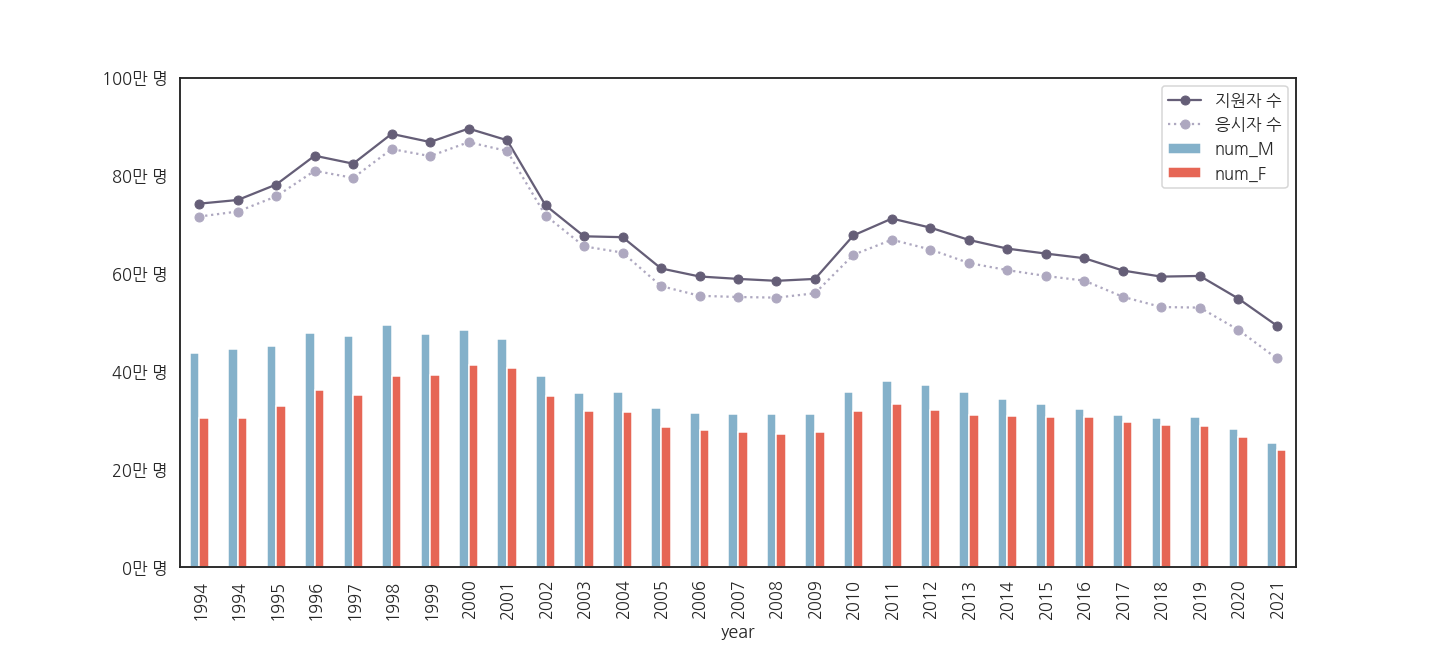
2.3. 지원자와 응시자
- 인구 감소에 따라 수능을 점점 적게 본다고 합니다.
- 얼마나 적게 보는지 확인해 봅시다.
1 | fig, ax = plt.subplots(figsize=(20, 9)) |
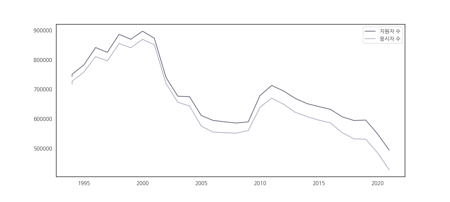
2.4. y축 범위, plot 모양 변경
- 응시자 수가 바닥으로 처박힙니다.
- 내년부턴 당장 수능이 없어질 것 같습니다.
- y축이 0부터 시작해야 올바른 비교가 가능합니다.
- 두 선을 잘 구분하기 위해 marker를 추가합니다.
1 | fig, ax = plt.subplots(figsize=(20, 9)) |
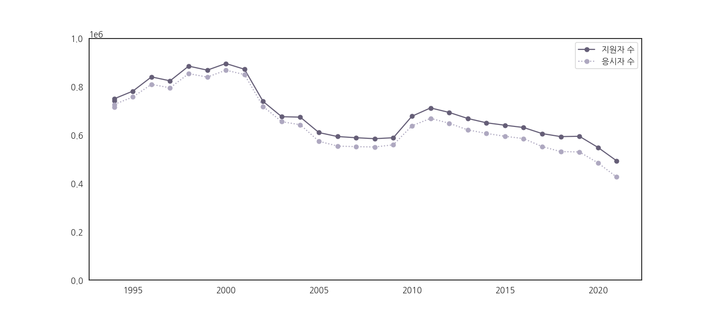
2.5. y축 숫자 표현 바꾸기
- y축 숫자를 읽기 어렵습니다.
- 만명 단위로 바꿔줍시다.
2.5.1. 실패: yticklabels
- y축 숫자는 yticklabels로 제어합니다.
.get_yticklabels()로 받아서.set_yticklabels()로 바꿔넣으면 될 것 같습니다.- 내친 김에 수능을 두 번 보는 바람에 꺾인 1994년 데이터 하나를 빼고 그립니다.
1 | fig, ax = plt.subplots(figsize=(20, 9)) |
- 나는 숫자를 더 좋게 표현하고 싶었을 뿐입니다.
- 그런데 숫자가 사라져버립니다!
- 왜 그런 걸까요?
1 | print(yticklabels) |

- yticklabels를 출력하면 이유를 알 수 있습니다.
- 숫자가 들어있어야 할
''안쪽이 비어있고, 대신 눈금(yticks)에 숫자가 있습니다. .plot()은 ticklabels에 값이 들어가지 않습니다.- 이 문제는 seaborn의 lineplot도 똑같이 가지고 있습니다.
2.5.2. 성공: yticks
- yticks를 받아서 넣어봅니다.
1 | # step 3. 데이터 표현 바꾸기 (2)-성공 |
-
yticklabels가 의도대로 출력됩니다!
-
코드를 보면
.set_yticks()는 아무 일도 하지 않고 있습니다. -
.get_yticks()으로 받은 후에.set_yticks()으로 그냥 넣거든요. -
그러나 같이 사용해야 합니다.
-
문법상
.set_yticklabels()는.set_yticks()뒤에 와야 하기 때문입니다.
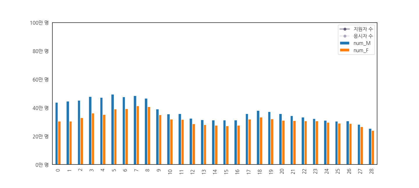
2.6. 남녀 수험생 수 함께 그리기
- 총 수를 그렸으니, 이번엔 남녀 수를 따로 그려봅니다.
- 남성과 여성이 나란하게 있는 bar plot을 사용합시다.
- matplotlib으로도 가능하지만 이런 표현은 pandas가 더 편리합니다.
1 | fig, ax = plt.subplots(figsize=(20, 9)) |
- 어라, 아까 그렸던 총 지원자와 응시자 수가 사라졌습니다.
2.6.1. 쪼개서 원인 분석 (1)
- 두 그림을 따로 그려서, 그려지기는 하는지 확인합시다.
1 | # subplot 두 개로 쪼개기 |
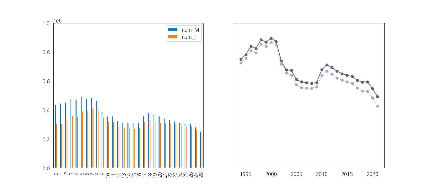
- 멀쩡히 잘 그려지고 있습니다.
- 그런데 왜 안나올까요? x축 범위가 수상합니다.
- 확인합시다.
1 | xticks0 = axs[0].get_xticks() |

- 문제의 원인을 알았습니다.
- 하나는 0~28, 하나는 1990~2025에서 그리고 있었던 겁니다.
- bar plot을 그릴 때 x 범위를 지정하지 않았기 때문에 벌어진 일입니다.
2.6.3. 쪼개서 원인 분석 (2)
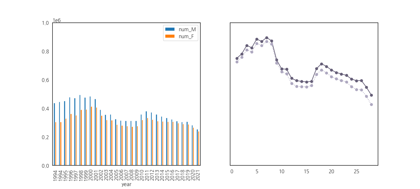
- 그럼, pandas로 그리는 bar plot에 x축 데이터를 넣어줍시다.
- year가 1994부터 2021까지이니 잘 될 것 같습니다.
1 | # subplot 두 개로 쪼개기 |

- bar plot의 x축이 1994부터 2021까지인데도 여전히 안됩니다.
- 다시 x축 범위를 확인합니다.
1 | xticks0 = axs[0].get_xticks() |

- 아까랑 똑같습니다.
- 왜냐면, pandas가 그리는 bar plot은 index를 x축으로 사용합니다.
- pandas에 x를 넣어도 xticklabels만 고치는 겁니다.
2.6.3. 쪼개서 원인 분석 (3)
- 이번엔
.plot()에서 x를 제거해 봅시다. - 그러면 둘 다 index 기준으로 그려지면서 잘 될 것 같습니다.
1 | # subplot 두 개로 쪼개기 |
- line plot의 x축이 0부터 시작하는 것으로 바뀌었습니다.
- 다시 x축 범위를 확인합니다.
1 | xticks0 = axs[0].get_xticks() |

- 느낌이 좋습니다.
- 이제 둘을 같이 그려봅니다.
1 | fig, ax = plt.subplots(figsize=(20, 9), sharey=True) |
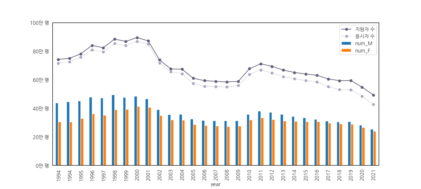
- 아까 생략했던 1994년 여름 수능 데이터도 다시 살립니다.
- 년도의 숫자가 아니라 index가 기준이기 때문에 같은 값이 여럿 있어도 겹치지 않습니다.
2.6.4. 성공
- 그림이 잘 나오는 것을 확인했습니다.
- 이제 남성, 여성용으로 저장해 둔 색상을 입혀줍니다.
pandas.plot()의 multiple bar plot의 색상은 dictionary 형태로 지시합니다.
1 | fig, ax = plt.subplots(figsize=(20, 9), sharey=True) |
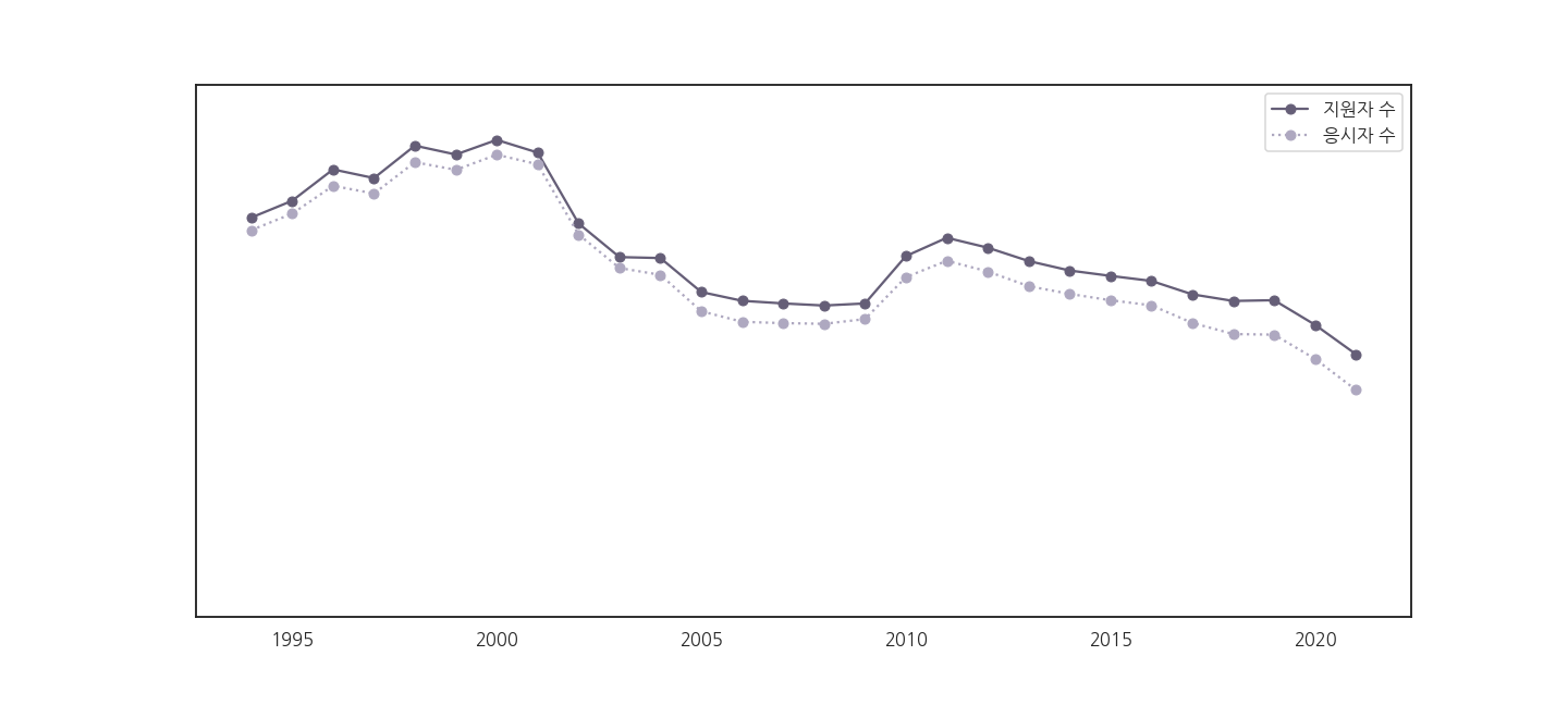
2.7. x축 눈금 레이블 변경
- 1994 ~ 2021까지 옆으로 누워있는 눈금이 보기 좋지 않습니다.
- 똑바로 돌리자니 공간이 부족합니다.
- 1997을 '97로 줄이는 방식으로 바꿔봅니다.
1 | fig, ax = plt.subplots(figsize=(20, 9), sharey=True) |
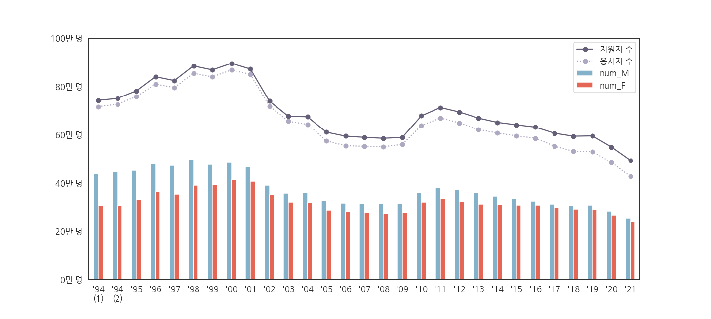
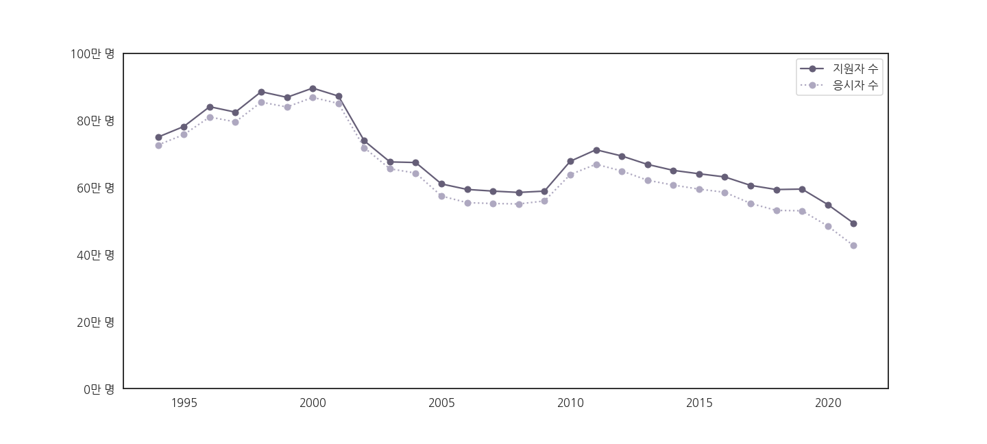
※ 28년을 이어온 수능의 역사를 그림으로 정리했습니다.
- 대충 봐도 보이는 메시지들이 있습니다.
- 전체적인 그림은 보였지만 손댈 곳이 여전히 보입니다.
- 다음 글에서는 legend를 비롯한 주변 요소들을 제어하겠습니다.
