contributor : Jerry Kim
- 색을 고르다 보면 이런 단어들을 만납니다:
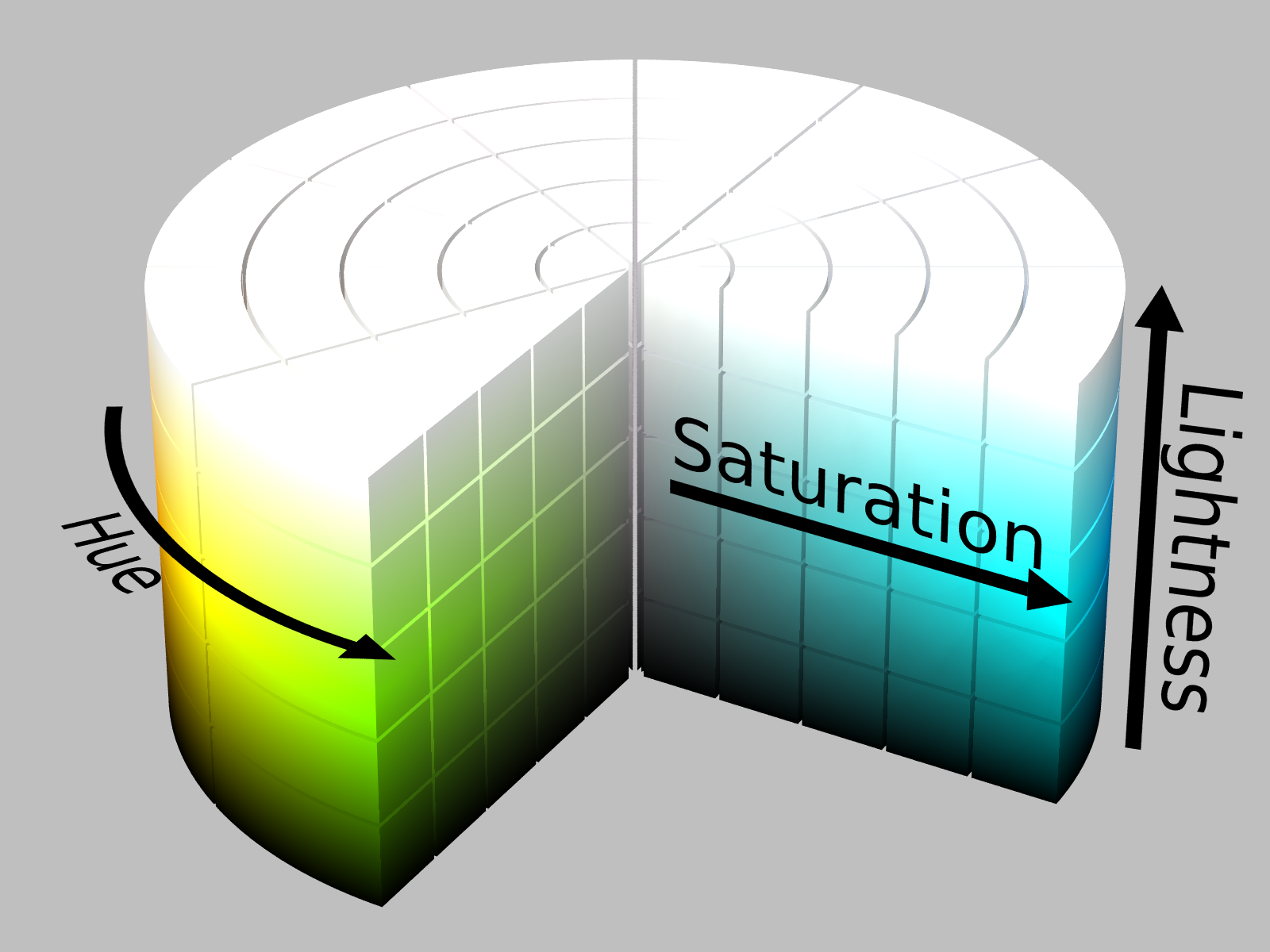
Brightness, Lightness, Value, Luminosity, Luma - 우리 말로는 모두 명도, 명도, 명도, 명도, 명도이지만 의미가 모두 다릅니다.
- 같은 뜻으로 생각하면 실수할 수도 있으니 한번 짚고 넘어갑시다.
1. 용어 정리
Gilchrist, “Lightness and Brightness”, Curr Biol. 2007
Lightness, Lumiosity, Luminance and Other Tonal Descriptors
wikipedia: CIELAB color space
wikipedia: HSL and HSV
데이터 시각화, 인지과학을 만나다 (에이콘)
-
lightness와 brightness에 대한 글은 2007년의 논문 설명이 가장 와닿았습니다.
-
value의 의미는 wikipedia가 가장 이해하기 좋았고,
-
전반적으로는 이 글에 용어들이 잘 정리되어 있습니다.
-
제 블로그 글에서도 용어가 왔다갔다 해왔습니다. 이제부터라도 통일하려고 합니다.
-
데이터 시각화, 인지과학을 만나다의 번역을 주로 따랐습니다.
- brightness : 명도(明度)
- lightness : 밝기
- luminance : 휘도(輝度)
- luminosity(luminous intensity) : 광도(光度)
- hue : 색상(色相)
- value : 밸류
- 모든 문서에 명도로 번역되어 있지만 brightness, lightness와 충돌합니다.
- 고민을 거듭한 끝에 영어 발음을 그대로 사용하기로 했습니다.
- relative luminance : 상대 휘도
1.1. 간단한 역사
Young-Helmholtz theory
wolfcrow: What is the difference between CIE LAB, CIE RGB, CIE xyY and CIE XYZ?
-
복잡한 일은 역사를 들여다보면 체계가 잡히기도 합니다.
-
1850년경 - RGB 3원색 이론: 영-헬름홀츠 색각설
- “빛의 3원색” = Red, Green, Blue
- R + G + B = White. 섞을 수록 밝아짐.
-
1906년 - CMYK 4색 인쇄: the Eagle Printing Ink Company
- “색의 3원색” = Cyan, Magenta, Yellow
- C + M + Y = Black. 섞을 수록 어두워짐.
- 수백년 전 RYB → CMY → CMYK
-
1913년 - 국제 조명 위원회(CIE) 설립
- Commission Internationale de l’éclairage
- 색에 대한 표준 등을 정립하는 단체
-
1931년 - CIERGB, CIEXYZ 색공간 정립
- RGB : 1920년대 수행된 인간 시각에 대한 연구 기반 (W. David Wright and John Guild)
- XYZ : 당시까지 알려진 인간 시각의 수학적 한계. Y=휘도, Z~blue, X=휘도와 직교하는 RGB의 나머지 요소
-
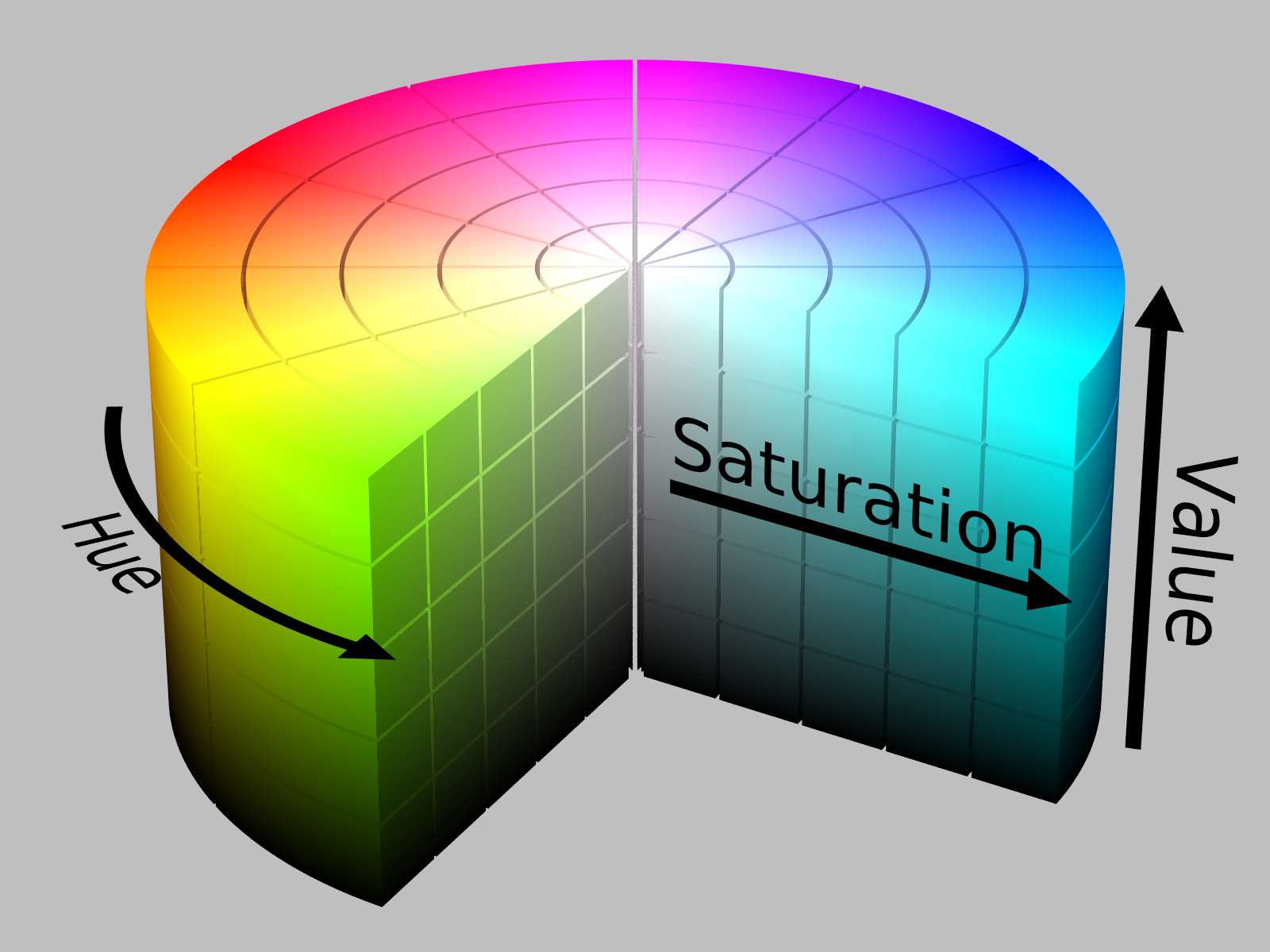
1938년 - HSL 색공간 정립
- Hue, Saturation, Luminosity (or Lightness)
- 목적 : 흑백으로 진행되던 TV 방송에 휘도(L) 데이터 변경 없이 color encoding 추가
-
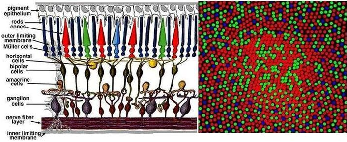
1956년 - 세 가지 원뿔세포가 R, G, B를 인식한다는 것이 알려짐 (Svaetichin, Acta Physiol Scand Suppl. 1956)
- 감응하는 파장은 558 nm, 531 nm, 419 nm 영역.
- 원뿔세포의 비율은 R : G : B = 40 : 20 : 1
-
1970년대 중반 - HSV 색공간 정립
- Hue, Saturation, Value
- 목적 : HSL보다 전통적이고 직관적인 색 혼합 모델
- 색이 어떻게 혼합되고 사람의 눈에 어떻게 보이는지에 중점.
-
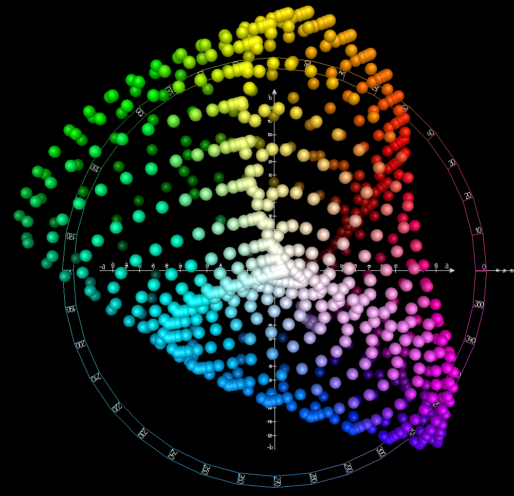
1976년 - CIELAB 색공간 정립
- 목적 : 사람의 인식과 최대한 비슷한 색 공간 구현
- $L^*$ : 휘도. black = 0, white = 100
- $a^*$ : green-red 요소. -128 ~ 127
- $b^*$ : blue-yellow 요소. -128 ~ 127
1.2. 용어의 뜻
-
luminosity(광도) $vs$ luminance(휘도)
- 광도 : 물체에서 발산되는 빛 에너지.
- 휘도 : 관찰자의 눈에 들어오는 빛. 단위 면적당 광도.
- 상황에 따라 둘 다 HSL의 구성요소로 사용됨.
-
brightness(명도) $vs$ lightness(밝기)
- 명도 : 어두움과 밝음의 정도. 주관적인 수치.
- 빛의 인식 : “perception of luminance”
- 밝기 : 흰색과 검정의 정도. 객관적인 수치.
- 빛이 반사되는 표면의 인식 : “perception of reflectance”
- 상황에 따라 HSL의 구성요소로 사용됨.
- 명도 : 어두움과 밝음의 정도. 주관적인 수치.
-
lightness(밝기) $vs$ value(밸류)
- 유채색의 밝기 : 유채색에 하얀 물감을 섞은 정도.
- 하얀 물감을 아주 많이 섞으면 본래 색이 사라지고 하얀 색이 됨.
- 유채색의 정도 : 유채색에 밝은 빛을 비춘 정도.
- 밝은 빛을 아주 강하게 비춰도 본래 색이 드러남.
- 유채색의 밝기 : 유채색에 하얀 물감을 섞은 정도.
-
relative luminance(상대 휘도)
- RGB 모니터의 밝기
- CIEXYZ의 Y(휘도)와 유사.
- $Y = 0.2126R + 0.7152G + 0.0722B$
2. Matplotlib Colormap 속성 분석
-
matplotlib에는 컬러맵이 다수 내장되어 있습니다.
-
이들 컬러맵은 어떤 색들을 가지고 있는지 살펴봅시다.
-
주의할 사항이 있습니다.
- Matplotlib 공식문서에 lightness($L^*$)라는 표현이 있습니다.
- 이 $L^*$는 CIELAB 색공간의 휘도(luminance)이고, 밝기(lightness)와는 다릅니다.
- 사람이 인지하는 밝은 정도는 휘도($L^*$)가 가깝습니다.
-
색(color)이라는 데이터의 속성이 어떻게 다른지 엄밀히 따져보겠습니다.
- 흔히 명도로 통용되는 데이터에 집중합니다.
- 밸류(V), 휘도($L^$), 상대 휘도(r$L^$), 밝기(L)가 그 대상입니다.
2.1. Perpetually Uniform Sequential Colormaps
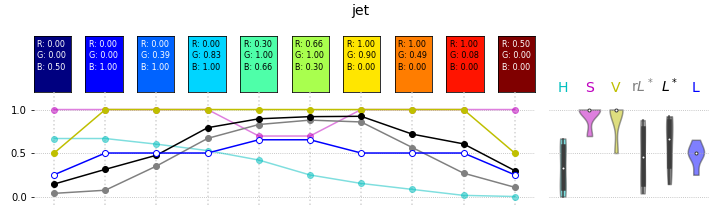
- Perpetually Uniform Sequential Colormap은 휘도($L^*$)가 직선으로 증가한다고 합니다.
- 맞는지 확인해봅시다.
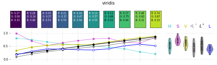
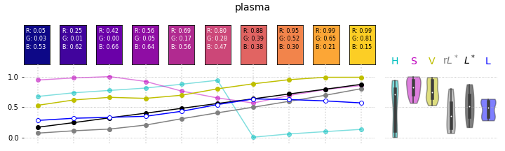
-
휘도가 넓은 범위에 걸쳐 선형으로 증가하고 있습니다.
-
밸류와 휘도, 밝기가 완전히 따로 놉니다.
- 시각적으로 어두운 색의 밸류가 높고, 밝은 색의 밸류가 낮기도 합니다.
- 밝기는 휘도와 비슷하게 가다가 어느 순간 이탈합니다.
- 밸류, 밝기, 휘도를 똑같이 명도로 번역하면 안될 것 같습니다.
2.2. Qualitative colormaps
- 범주(category)별 비교에 주로 사용되는 qualitative colormap은 휘도($L^*$)가 거의 균일합니다.
- 사람의 눈은 휘도를 데이터의 크고 작음으로 생각하는 경향이 있기 때문에,
- 혼동을 주지 않도록 비슷한 휘도의 색을 나열하는 것입니다.
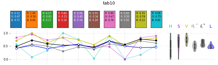

- Perpetually Uniform Sequential Colormap에 비해 $L^*$가 특정 구간에 몰려있습니다.
- 하지만 Accent는 그렇지 않네요. 사용시 주의해야겠습니다.
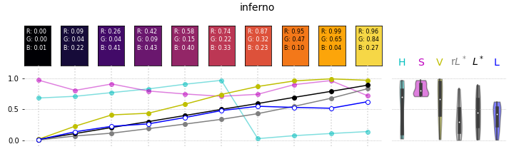
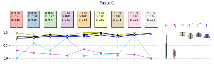
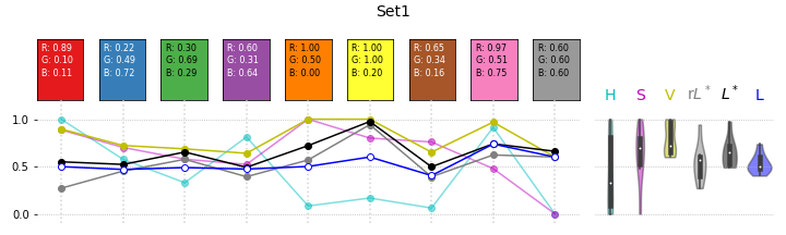
2.3. Miscellaneous colormaps
- 기타 컬러맵입니다.
- 자주 사용되는 것들을 살펴봅니다.
-
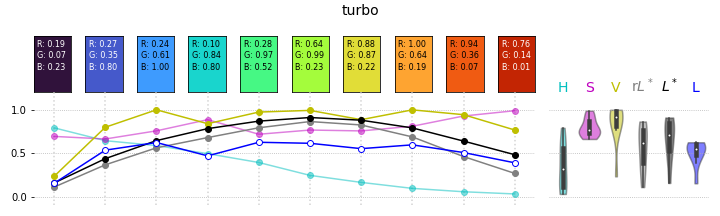
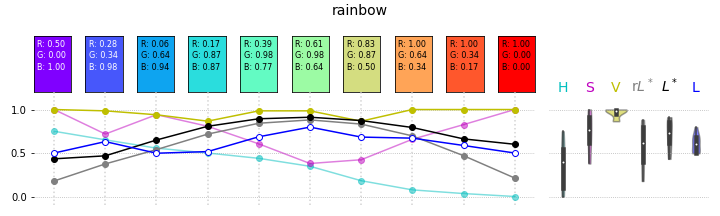
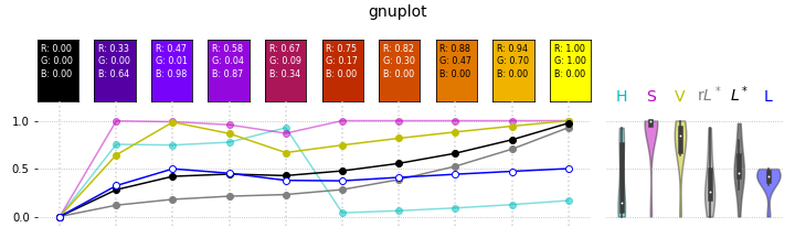
비슷한 무지개 계열임에도 gluplot은 순서를 바꿔서 휘도가 순차적으로 증가합니다.
-
전체적으로 상대 휘도, 휘도는 값이 유사하지만, value(밸류)와는 상당히 다릅니다.
-
밝기도 어느 정도 휘도와 비슷한 경향을 따릅니다.
-
많은 문서에서 value를 명도라고 번역하는 바람에 lightness(밝기), brightness(명도)와 혼동되지만 이렇게 그려놓고 보니 절대 혼용하면 안 되는 개념이라는 생각이 듭니다.
3. Matplotlib 구현
- 앞에 나열된 그림들을 그리는 코드를 설명합니다.
- V(value: 밸류), r$L^$(relative luminance: 상대 휘도), $L^$(lightness: 휘도), L(lightness: 밝기)를 중심으로,
- H(hue: 색상), S(saturation: 채도)의 변화도 함께 봅니다.
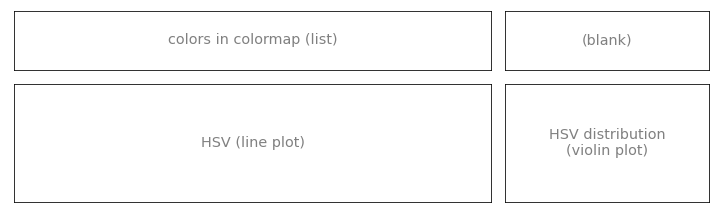
3.1. 시각화 설계
-
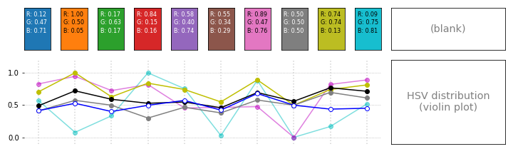
이렇게 화면을 구상했습니다.
- 컬러맵의 색상들을 좌측 상단에 나열하고,
- 각 색상에 대응되는 H, S, V, r$L^$, $L^$, L을 바로 아래에 line plot으로 그립니다.
- 그리고 속성들의 분포를 우측 하단에 violin plot으로 그립니다.
- 우측 상단은 비웁니다. 단, 우측 하단의 xticklabel 대신 우측 상단 공간을 활용하겠습니다.
-
위 그림을 그린 코드는 이렇습니다.
1 | import matplotlib.pyplot as plt |
3.2. 컬러맵 뿌리기
3.2.1. 컬러맵 가져오기
-
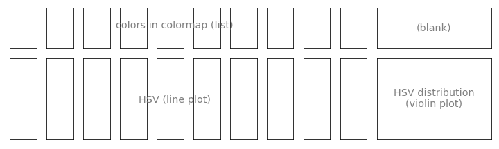
컬러맵을 하나 골라서 뿌려봅니다.
- 좌측 상단 구역을 색 갯수만큼 나눠야 합니다.
-
컬러맵의 종류에 따라 색상의 갯수를 지정하는 방식이 달라집니다.
- Qualitative colormap은 갯수가 지정되어 있습니다.
- 그 외의 컬러맵은 갯수를 지정해야 합니다.
- 10개로 지정합니다.
1
2
3
4
5
6
7
8
9
10
11
12
13
14
15
16
17
import matplotlib.pyplot as plt
from matplotlib import cm
# 컬러맵 불러오기
cmap_ = plt.get_cmap("tab10")
# 컬러맵의 색 수
ncmap = len(cmap_.colors)
try: # qualitative colormap
ncmap = len(cmap_.colors)
except AttributeError: # others
ncmap = 10
cmap_ = cm.get_cmap(cmap, ncmap)
# 수가 너무 많으면 10개로 제한
if ncmap > 15:
ncmap = 10
3.2.2. 컬러맵 subplots 나누기
-
목적에 맞게 subplots를 준비합니다.
- 좌측 상단 구역에 색상을 하나씩 넣을 것입니다.
- line plot을 그릴 공간까지 잘려버렸지만 일단 넘어갑니다.
-
위 그림을 그린 코드는 이렇습니다.
1 | # subplots 나누기 (ncmap 반영) |
3.2.3. 컬러맵 색상 칠하기
-
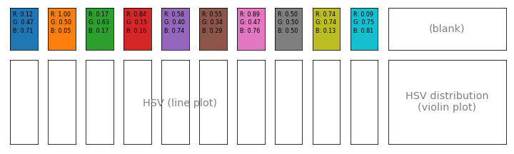
컬러맵 색상을 하나씩 넣습니다.
- 색상에서 RGB를 추출해 글자로 넣습니다.
- 컬러맵에 정수 i를 넣거나 0~1 사이의 값을 넣으면 이에 해당하는 색이 추출됩니다.
-
위 그림을 그린 코드는 이렇습니다.
1 | # 컬러맵 불러오기 |
3.3. 색상 정보 line plot
3.3.1. 좌측 하단 subplots 합치기
matplotlib: Customizing Figure Layouts Using GridSpec and Other Functions
-
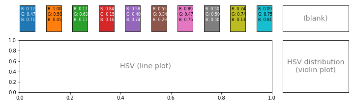
Matplotlib에서 subplots를 합치는 과정은 다음 두 단계를 거칩니다.
- 기존의 subplots를 삭제합니다.
- 빈 공간에 맞게 새 subplot을 그립니다.
-
좌측 하단 공간에 axbig이라는 새로운 이름이 붙었습니다.

-
코드는 이렇습니다.
1 | # 컬러맵 불러오기 |
3.3.2. 색 속성 추출
-
RGB 데이터를 HSV로 변환합니다.
-
다른 한편으로 휘도(luminance)와 밝기(lightness)로도 변환합니다.
- 휘도 변환에는 colorspacious 라이브러리를 사용하고,
- 밝기 변환에는 colorsys를 사용합니다.
- 그리고 이들을 list로 모읍니다.
- 어두운 색들의 글자 색도 하얗게 바꿉니다.
-
여기까지 코드는 이렇습니다.
1 | import matplotlib.pyplot as plt |
3.3.3. 색별 속성 시각화
-
컬러맵 색상들 아래에 속성을 line plot으로 시각화합니다.
- x축 눈금은 불필요하므로 제거하고 y축만 남깁니다.
- 데이터를 상단의 컬러맵과 매칭하기 좋도록 grid를 추가합니다.
- 전체 윤곽선도 불필요하므로 제거합니다.
-
이것 하나만 해도 일반적인 하나의 plot이네요.
-
코드가 제법 길어졌습니다.
1 | import matplotlib.pyplot as plt |
3.3.4. 컬러맵별 속성 분포
-
데이터가 여섯 개나 되고, 뭐가 뭔지 알아보기 힘듭니다.
-
violin plot으로 분포를 확인합니다.
.get_children()으로 violin plot을 하나씩 지정하고,.set_facecolor()로 violin plot의 색상을 데이터 종류에 맞추어 지정합니다.- 비슷하게
.set_alpha()를 사용해서 불투명도를 제어합니다.
-
속성 분포를 개별 색의 데이터와 비교하기 좋게 배열합니다.
- y 범위를 맞춰 우측 아래 공간에 넣습니다.
- 색상별 데이터 이름을 함께 적어줍니다.
plt.subplots()의gridspec_kw에"hspace":0을 넣어 위 아래 사이 공간을 좁혀줍니다.
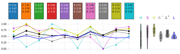
- 그럴싸한 통계 분석이 되었습니다.
1 | import matplotlib.pyplot as plt |
