- 새로운 데이터는
numpy.random함수로 만들 수 있습니다. - 정규분포나 균일하게 만드는 것은 많이들 합니다만,
- 기존 데이터의 분포를 모방해 봅시다.
1. 기존 데이터
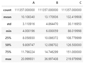
- 10만개가 조금 넘는 데이터가 있습니다.
- 대강 이렇게 생겼습니다.
1 | import pandas as pd |
seaborn.set_palette
seaborn.set_context
seaborn.set_style
seaborn.histplot
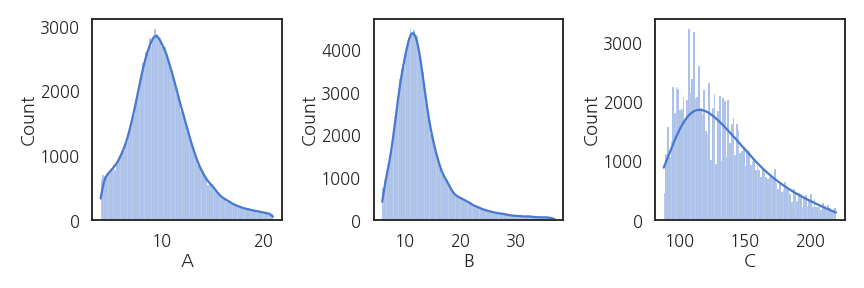
- 분포를 확인해보겠습니다.
- 보고용 그림이 아니므로 손을 많이 대고 싶지 않습니다.
- 스타일을 잡고 간단히 그립니다.
- seaborn이 이럴 때 좋습니다.
1 | import matplotlib.pyplot as plt |
- 2변수 분포를 확인해보겠습니다.
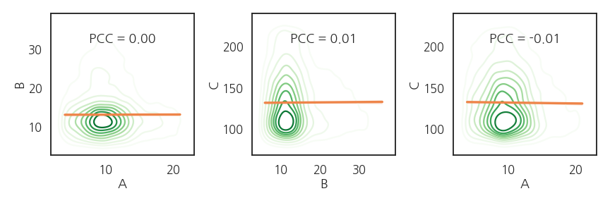
- 2차원 KDE plot을 그리고 pearson correlation coefficient를 봅니다.
1 | PCC_AB = df.corr().loc["A", "B"] |
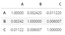
실행결과: 피어슨 계수가 모두 작네요.
1 | 0.2813347529044316 0.025736569810035914 0.0011956781154378422 |
- 2차원 분포에 같이 얹어봅니다.
1 | fig, axs = plt.subplots(ncols=3, figsize=(12, 4)) |
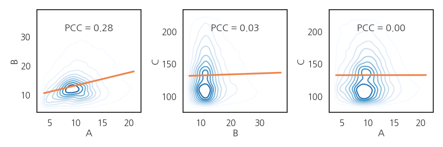
- A와 B 사이에 상관관계가 있지만 매우 약합니다.
- C는 A, B와 전혀 관계가 없어보입니다.
2. histogram fitting
- 원 데이터의 분포를 재현하려면 함수로 모사해야 합니다.
- 히스토그램이 정규분포만으로는 설명이 되지 않습니다.
- A와 B : $$y = (ax + b) + e^{-\frac{1}{2} (\frac{x-\mu}{\sigma})^2}$$로,
- C : $$y = (ax + b) + Ae^{-\frac{1}{2} (\frac{x-\mu_A}{\sigma_A})^2} + Be^{-\frac{1}{2} (\frac{x-\mu_B}{\sigma_B})^2}$$로 가정합니다.
1 | from scipy.optimize import curve_fit |
- 데이터 A의 히스토그램 계급과 갯수를 추출합니다.
1 | # histogram of A |
- 데이터 B와 C도 같은 요령으로 처리합니다.
1 | fig, axs = plt.subplots(ncols=3, figsize=(12, 4)) |
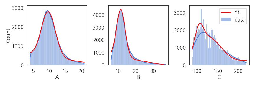
- fitting된 함수가 데이터 분포와 잘 맞습니다.
- C는 모양을 조금 더 잘 반영하고자 gaussian을 하나 더 추가해서 의도적으로 조금 복잡하게 만들었습니다.
3. 데이터 생성
numpy.random은choice명령으로 샘플링을 할 수 있습니다.
1 | A = [1, 2, 3] |
실행결과: 균일하게 뽑혀나옵니다.
1 | array([2, 1, 1, 3, 2, 2, 1, 2, 3, 2]) |
- 추출 확률을 조정할 수 있습니다.
- 1, 2, 3 중 3만 뽑히도록 조작합시다.
1 | A = [1, 2, 3] |
실행결과: p=1로 설정된 3만 반복해서 나옵니다.
1 | array([3, 3, 3, 3, 3, 3, 3, 3, 3, 3]) |
-
확률을 조정해 추출하는 함수를 만듭니다.
- 분포를 재현할 함수가 필요합니다.
- fitting 함수 이름과 파라미터를 입력받도록 합니다.
- 함수에 맞춰 지정된 갯수의 데이터를 생성합니다.
-
데이터 생성 및 추출 함수입니다.
1 | def gen_data(x, fit_func, fit_param, number): |
- 데이터를 10000개 생성합니다.
1 | gen_A = gen_data(xa_new, fit_lingau, popt_A, 10000) |
- 생성된 데이터의 분포를 원본과 비교합니다.
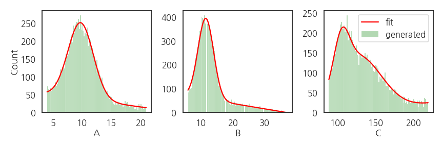
- 원본의 빨간 선과 생성데이터의 녹색이 거의 일치합니다.
1 | fig, axs = plt.subplots(ncols=3, figsize=(12, 4)) |
- 생성된 데이터간의 상관성을 확인합시다.
1 | df_gen = pd.DataFrame({"A":gen_A, "B":gen_B, "C": gen_C}) |
- 독립적으로 생성되었기 때문에 변수간 관계가 없습니다.
- 다시 2변수 분포를 확인합니다.
1 | gen_PCC_AB = df_gen.corr().loc["A", "B"] |
- A와 B 사이의 상관관계가 소멸되었습니다.
- 그러나 B와 C, A와 C는 2차원 분포까지 재현되었습니다.
- 약한 상관성을 어떻게 확보할지는 더 고민해보겠습니다.
