- 2차원 공간의 데이터 분포를 표현합니다.
- 많이 사용하는 기능이면서도 막상 쓰려면 디테일에 발목을 잡힙니다.
- Matplotlib, seaborn에 이어 mpl-scatter-density도 알아봅니다.
1. 2D data distribution
-
데이터가 2차원으로 분포하는 경우는 매우 흔합니다.
-
N차원으로 분포하는 데이터의 두 차원만 떼어 보여주는 경우도 많고
-
머신러닝 모델의 예측 성능을 평가하는 parity plot도 그렇습니다.
-
먼저 필수 라이브러리를 불러오고
1 | %matplotlib inline |
- 2차원에 분포한 데이터를 만듭니다.
- $y = x^2$를 사용해서 막대기같은 데이터보다는 조금 보기 좋은 모양을 만듭니다.
- 데이터는 1만개입니다. 0이 많은 숫자를 쓸 때 천 단위로 _를 넣어주면 읽기 좋습니다.
1 | x = np.linspace(0, 10, 10_000) + np.random.normal(0, 1, 10_000) |
2. 정석, scatter plot
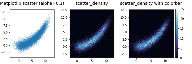
- x, y 공간에 분포한 데이터 시각화의 정석은 scatter plot입니다.
- 경험으로부터 좁은 공간에 밀집한 점은 서로를 가린다는 것을 알고 있습니다.
alpha=0.1로 투명도 90%를 설정해서 겹친 점이 보이게 합니다.
1 | fig, axs = plt.subplots(ncols=2, figsize=(8, 4), |
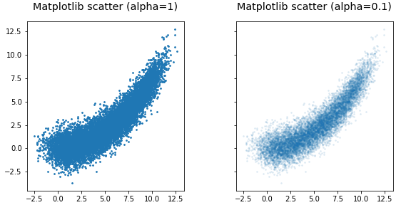
- 반투명이 적용되지 않은 왼쪽은 데이터의 위치는 보이지만 밀도가 보이지 않습니다.
- 반투명을 90% 적용한 오른쪽은 데이터의 밀도는 보이지만 경계가 잘 보이지 않습니다.
- 고급 방법이 필요합니다.
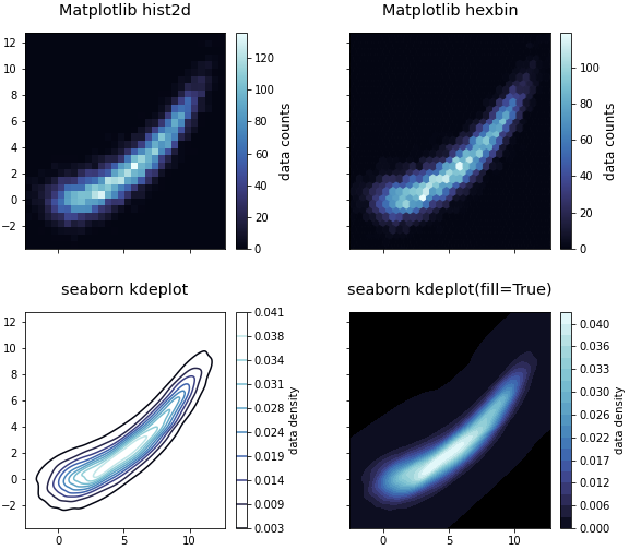
3. 2D histogram, hexbin, KDE plot
-
1D에서 많이 쓰는 histogram과 KDE plot은 2D에도 적용 가능합니다.
-
2D 공간을 육각으로 나누는 hexbin도 사용할 만 합니다.
-
조금 색다른 colormap을 사용합시다.
-
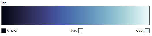
얼음을 정말 그럴듯하게 표현하는 ice colormap이 있습니다.
-
ice colormap을 cmap이라는 변수에 넣어서 사용하기로 합니다.
1 | import cmocean.cm as cmo |
- Matplotlib의 hist2d, hexbin,
- seaborn의 kdeplot에 ice colormap을 입혀 사용합니다.
sns.kdeplot()은fill=True를 추가하면 등고선이 아니라 면을 칠합니다.levels에 충분히 큰 값을 넣어서 매끄러운 그라데이션을 구현합니다.- 바탕이 텅 비어버리므로
set_facecolor('k')를 넣어서 배경을 검게 한번 더 칠합니다.
1 | fig, axes = plt.subplots(ncols=2, nrows=2, figsize=(8, 8), |
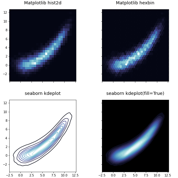
- 코딩을 한 보람이 비로소 느껴집니다.
4. colorbar 달기
-
데이터의 밀도를 표현하는 그림에서 색이 나타내는 데이터의 수나 밀도는 중요하지 않을 지도 모릅니다.
-
그러나 교양 삼아 colorbar를 붙이는 방법을 짚고 넘어갑시다.
-
필요할 때 붙이려면 은근히 안 붙습니다.
-
Matplotlib hist2d은 return하는 여러 값 중 맨 마지막이 그림입니다. -
맨 마지막만
im0라는 이름으로 받아서 이를plt.colorbar()에 넣습니다. -
Matplotlib hexbin은 곧장 그림을 return합니다. -
그대로
im1로 받아서 넣습니다. -
Matplotlib에서 만든 colorbar는
set_label로 이름을 추가할 수 있습니다. -
seaborn KDE plot은 자체에 colorbar 출력을 결정하는 매개변수가 있습니다. -
cbar=True로 놓고cbar_kws에 속성을 결정하는 키워드를 딕셔너리 형식으로 추가합니다.
1 | fig, axes = plt.subplots(ncols=2, nrows=2, figsize=(8, 7), |
5. mpl-scatter-density
- mpl-scatter-density라는 라이브러리가 있습니다.
- scatter plot을 그리면 점의 밀도를 계산해서 색을 입혀주는 라이브러리입니다.
- 위에서 살펴본 Matplotlib, seaborn 자체 기능과 얼마나 비슷하고 다른지 살펴봅니다.
- 먼저, 노트북 셀 안에서 설치합니다.
1 | !pip install mpl-scatter-density |
- 공식 홈페이지에 나온 설명을 따라 그립니다.
- 공식 홈페이지에는 Figure와 Axes를 따로 그리면서
ax = fig.add_subplot(1, 1, 1, projection='scatter_density')를 사용했습니다. plt.subplots()를 사용할 때는subplot_kw={"projection":"scatter_density"}를 추가하면 됩니다.
1 | import mpl_scatter_density |
- scatter plot과 비슷한 명령이면서도 점의 밀도에 따라 밝기가 달라졌습니다.
- 위 코드를 보면 해상도를 의미하는
dpi라는 매개변수가 사용되었습니다. - Axes를 가로세로 구간으로 나누어 각 구간 안에 들어오는 점의 수를 세는 것입니다.
- 음? Matplotlib hist2d랑 같은 것 아닌가 모르겠습니다?
6. Matplotlib hist2d vs mpl-scatter-density
- Matplotlib hist2d와 1:1로 비교합니다.
- Matplotlib hist2d는
bins매개변수로 해상도를 조절합니다. - 두 명령을 번갈아 사용하며 다양한
bins와dpi매개변수를 적용합니다.
1 | fig, axes = plt.subplots(nrows=2, ncols=4, figsize=(10, 6), subplot_kw={"projection":"scatter_density"}, |
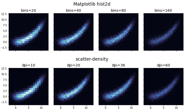
- 두 명령의 결과가 거의 동일합니다
- 원리가 같기 때문에 당연한 결과입니다. 실행 시간도 체감할 수 없을만큼 차이가 나지 않습니다.
- 둘이 만드는 객체를 비교합니다. 먼저 Matplotlib hist2d입니다.
1 | # Matplotlib hist2d |
- 실행 결과
1 | <matplotlib.collections.QuadMesh at 0x7f1d06764510> |
- 이번에는 scatter-density 입니다.
1 | # scatter-density |
- 실행 결과
1 | <mpl_scatter_density.scatter_density_artist.ScatterDensityArtist at 0x7f1d066f97d0> |
- 별도의 라이브러리를 사용하고 projection을 따로 지정하는 만큼 별도의 객체를 생성하고 있습니다.
7. 결론
- scatter-density는 원리와 출력물의 외관이 Matplotlib hist2d와 같은 결과물을 내놓습니다.
- 라이브러리가 크게 부담스럽지 않아 추가로 설치하는 것은 괜찮습니다.
- 그러나 함수의 매개변수가 적어 표현력이 제한되어 있고 결과물이 Matplotlib 표준이 아니라는 점이 아쉽습니다.
- 특별한 이유가 있지 않다면 Matplotlib hist2d를 사용하는 것을 권장드립니다.
