- seaborn 0.11에서 업데이트된 distribution plot을 살펴봅니다.
- distplot()이 없어진 대신 displot()이 들어왔습니다.
- matplotlib으로 만든 틀 안에 seaborn을 넣어봅니다.
1. displot()
-
displot()은histplot(),kdeplot(),ecdfplot(),rugplot()을 편하게 그리는 방법입니다- 편하게라는 말은 하나의 명령어(
displot())로 여러 형태를 그릴 수 있다는 뜻입니다. - 장점은 하나의 인자
kind를 바꿔주는 것 만으로 그래프의 형태를 바꿀 수 있다는 것, - 단점은 그림의 인자들이 그래프 종류마다 다르다는 점입니다.
- 그 바람에
kind외에도 다른 인자들을 많이 바꾸게 된다는 것입니다.
- 편하게라는 말은 하나의 명령어(
-
인자만 바꿔도 되는데 다른 인자도 많이 바꿔야 한다니 모순입니다.
- 조금 풀어서 설명하면,
- 기본 세팅된 그림을 그리려면 인자만 바꾸면 된다
- 그러나 여기저기 수정하려면 여러 인자를 바꿔야 한다 입니다.
-
displot()을 알아보는 과정은 세부 기능들을 알아보는 기능과 거의 동일합니다. -
세부 기능들을 먼저 알아보겠습니다.
2. histplot(), kdeplot(), ecdfplot()
seaborn.histplot
seaborn.kdeplot
seaborn.ecdfplot
seaborn.rugplot
2.1. plots
-
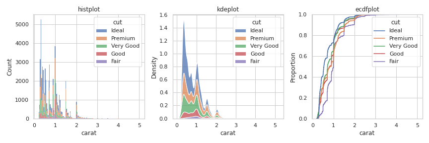
rugplot()은 단독으로 사용하기 어렵습니다. -
다른 세 plot을 하나의 figure에 담아보겠습니다.
plt.subplots()명령으로Figure와Axes를 생성하고,- seaborn plot 함수에
ax=인자를 삽입하여 그려질axes를 지정합니다.
-
동일 x값을 쌓아주도록
multiple="stack"을 지정합니다.
1 | import matplotlib.pyplot as plt |
2.2. proportion
-
별도의 설정을 하지 않았는데도 y축 label이 그래프마다 다릅니다.
histplot()은Countkdeplot()은Densityecdfplot()은Proportion으로 되어 있습니다.ecdfplot()의 뜻은 empirical cumulative distribution functions 입니다.
-
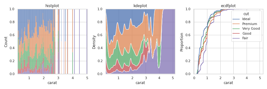
위 코드에서
multiple부분을"fill"로 변경하면 비율을 그립니다. -
단위가 바뀌었지만 y축 label은 변하지 않았습니다. 주의해야 합니다.
1 | fig, axes = plt.subplots(ncols=3, figsize=(12,4)) |
2.3. bivariate distribution
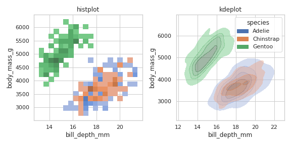
- x와 y축에 다른 변수를 지정하면 2변수 분포도를 그릴 수 있습니다.
ecdfplot()에는 적용되지 않습니다.- 범주형(categorical) 변수에는 적용되지 않으니 주의합니다.
1 | # Load the penguins dataset |
3. displot() vs kdeplot()
-
diamond 데이터셋을
displot()과kdeplot()으로 그려 비교해 보겠습니다. -
displot()은FacetGrid를 생성합니다.- matplotlib이 생성하는
Figure와Axes를 포함하는 객체입니다. - 따라서 matplot이
subplot으로 생성하는Axes에 담길 수 없습니다.
- matplotlib이 생성하는
-
displot()은 matplotlib의pyplot방식으로 사용해야 합니다. -
그림 크기는
height와aspect로 제어합니다.
1 | sns.displot( |
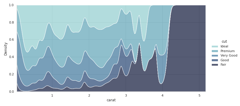
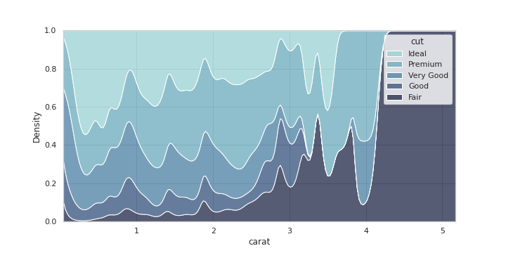
- 반면
kdeplot()은Axes를 생성합니다. ax인자를 사용해subplot으로 미리 생성한Axes에 담을 수 있습니다.
1 | fig, ax = plt.subplots(figsize=(10, 5)) |
-
두 그림의 legend가 묘하게 다릅니다.
displot()은 옆으로 밀려있고,kdeplot()은axes안에 담겨 있습니다.
-
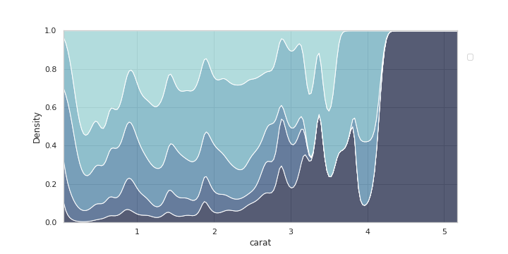
그런데 문제가 있습니다.
- legend를 옮기려면
axes.legend()로 제어해야 합니다. - 그리고
legend(handles, labels)형태로 데이터를 넣어야 하는데, - handles와 labels를 추출하는
axes.get_legend_handles_labels()가 작동하지 않습니다.
- legend를 옮기려면
-
handles, labels를 출력시켜도 모두 []로만 나옵니다.
-
legend는 텅 비어 있습니다.
1 | # object oriented interface |
- 강제로 labels를 인가하면 legend를 제어할 수 있습니다.
- 그러나 순서가 반대이고, 반대로 넣으면 언제나 색상과 맞는지 확신이 없습니다.
1 | fig, ax = plt.subplots(figsize=(10, 5)) |
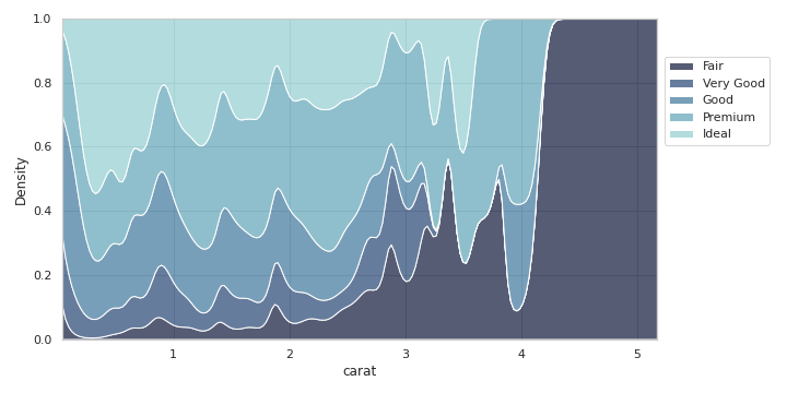
- 아쉽게도 seaborn 공식문서에도 설명이 제대로 나오지 않았네요.
- 본 방법은 임시변통으로만 알고 정석을 찾아야 할 것 같습니다.
- 혹시 이 글을 보시는 분께서 방법을 알고 계시면, 제보 부탁드리겠습니다.
- jehyun.lee@gmail.com
