- 밀도 함수는 데이터 분포를 볼 때 가장 많이 그리는 그림 중 하나입니다.
- 특정 값을 기준으로 Pass와 Fail을 정한다고 할 때, 전체의 비율도 중요합니다.
- seaborn kdeplot을 살짝 다듬어서 쪼개고 비율을 계산합니다.
1. 오늘의 목표
- 오늘 우리는 데이터를 선별하는 데 쓰는, 이런 그림을 그릴 겁니다.
- 특정 값을 기준으로 왼쪽은 Fail, 오른쪽은 Pass입니다.
- 공장에서 발생하는 양품과 불량품으로 생각을 해도 좋고, 학생들 시험 결과의 분포로 봐도 좋습니다.
- 중요한 것은 특정 지점을 기준으로 KDE plot을 자르고, 좌우를 다른 색으로 칠하는 것입니다.
2. 데이터 → 밀도 함수
numpy를 사용해서 정규분포에 가까운 데이터를 만듭니다.np.random.normal()을 사용하면 뚝딱 만들어집니다.loc,scale을 사용해서 평균과 표준편차를 지정하고,size에는 10만을 넣습니다.- 이렇게 얻은 결과를
seaborn.kdeplot()으로 밀도함수로 표현합니다.
1 | %matplotlib inline |
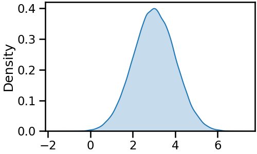
- 매끈한 밀도함수가 얻어졌습니다.
- 이토록 데이터 분포가 매끈해보이는 것은
seaborn.kdeplot()에 숨겨진gridsize=200이라는 매개변수 덕분입니다. - 데이터가 쪼개지는 지점을 눈에 잘 띄게 하겠습니다.
gridsize=20을 입력해서 같은 데이터를 거칠게 표현합니다.
1 | fig, ax = plt.subplots(figsize=(5, 3), constrained_layout=True) |
3. 밀도 함수 절단
-
똑같은 데이터인데 전혀 매끈하지 않습니다.
-
한 눈에 봐도 꼭지점과 선분으로 이루어진 다각형이라는 것을 알 수 있습니다.
-
$x = 2$
-
꼭지점 중 $x > 2$만 남겨서 이것들로 다각형을 새로 만들면 되지 않을까요?
-
KDE plot을 구성하는 다각형은
ax.collections로 추출할 수 있습니다. -
이 중에서도 윤곽선은
.get_path()[0]명령으로 뽑아낼 수 있고, -
꼭지점은 여기에
.vertices, 꼭지점의 특성은.codes속성을 보면 됩니다. -
한번 추출해 봅니다.
1 | # vertices |
- 실행 결과
1 | # vertices = [[-1.68144422e+00 4.44446302e-07] |
- vertices에는 수많은 점의 $(x, y)$ 좌표가 나열되어 있습니다.
- 이 데이터를 기준으로 threshold를 적용하면 될 것 같습니다.
- 해당 데이터의 index를 추출합니다.
1 | # x > 2 인 꼭지점 추출 |
- 실행 결과
1 | array([ 9, 10, 11, 12, 13, 14, 15, 16, 17, 18, 19, 20, 21, 22, 23, 24, 25, |
- codes가 중요한 정보를 담고 있습니다.
- 1은 시작점, 2는 연결점, 79는 polygon close입니다.
- $ x > 2 $인 점들의 index를 추출하다 보면 code가 규칙에서 어긋날 수 있습니다.
- 그렇기 때문에, 첫 점과 마지막 점의 code에 강제로 1과 79를 할당합니다.
- 이렇게 추출된 vertices와 codes를 다시 윤곽선을 의미하는 path에 할당하고 그림을 그리면 변화가 관찰됩니다.
1 | vertices_th = vertices[idx_th] |
4. 부가 요소 활용
- 전체 코드를 한 번 정리합니다.
gridsize를 기본값으로 복구시켜 매끈한 곡선을 얻고,- 밀도 함수를 절단한 뒤 다시 전체 밀도 함수를 선으로만 그려 부분과 전체를 동시에 표시합니다.
1 | fig, ax = plt.subplots(figsize=(5, 3), constrained_layout=True) |
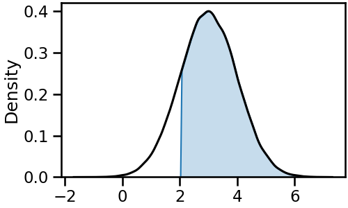
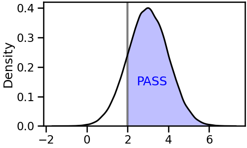
- 이제 저 영역이 Pass라는 것을 문자를 사용해 명시합니다.
- 색도 기본색보다 조금은 의지를 반영해 특정 색을 지정합니다. 파랑으로 갑시다.
- 기준점이 되는 $x = 2$에 기준 막대도 우뚝 세워줍니다.
1 | fig, ax = plt.subplots(figsize=(5, 3), constrained_layout=True) |
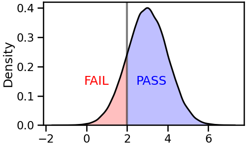
- 같은 요령으로, 왼쪽에 FAIL이라고 명시할 수 있습니다.
- 동일한 작업을 threshold 방향만 바꾸어 반복하면 됩니다.
코드 보기/접기
1 | # PASS and FAIL |
5. 넓이 계산
-
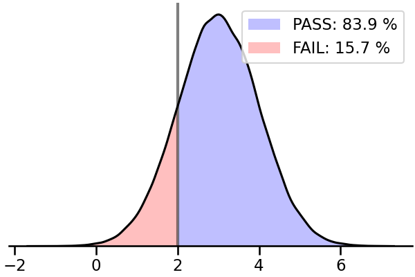
이런 시각화는 그림 뿐 아니라 숫자도 중요합니다.
-
기준선을 넘은 데이터가 전체의 몇 %인지, 넘지 못한 것은 얼마인지 알아야 합니다.
-
밀도 함수의 전체 넓이는 1이라는 사실은 널리 알려져 있지만 이렇게 자르면 계산이 어렵습니다.
-
shapely라이브러리가 이런 도형 계산에 편리합니다. -
shapely.geometry.Polygon()에 vertices를 넣은 뒤.area속성을 출력하면 넓이가 나옵니다.
1 | from shapely.geometry import Polygon |
- 실행 결과
1 | # PASS: 83.87 % |
- 더해서 100%가 되어야 하는데, 0.5%가량 부족하지만 전체적으로 얼추 맞습니다.
- 대략 84%는 Pass, 16%는 Fail로 볼 수 있을 듯 합니다.
- 실제 앞에서 만든 우리 데이터셋으로 확인하면 84.25% vs 15.75%라고 합니다.
1 | print(f"# PASS (Ground Truth): {len(set0[set0 > 2])/1e5 * 100:.2f}") |
- 실행 결과
1 | # PASS (Ground Truth): 84.25 |
6. 함수 제작
- 자, 이제 함수를 만들어 사용합시다.
- data와 threshold를 필수로 입력하게 하고, pass와 fail의 색, 그리고 gridsize를 보조 입력으로 받습니다.
- 제가 만드는 다른 함수들처럼 활용성을 위해 Axes를 입력받을 수 있는, Axes를 출력하는 함수로 만듭니다.
- 이러면 다른 큰 그림의 일부로 활용하기 좋습니다.
1 | # 함수 정의 |
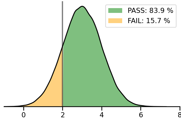
- Pass와 Fail 비율은 범례로 출력하게 만들었습니다.
- 실제 활용시 다른 그래프와 중첩될 수 있고, 그래프 모양이 데이터에 따라 달라지기 때문에
- 아까처럼 그래프 위에 글자를 놓으려면 고칠 일이 더 많아질 수 있기 때문입니다.
- 이제 한 줄로 threshold가 반영된 밀도 함수를 그릴 수 있게 되었습니다.
7. 함수 수정
- 이렇게 만들어진 그래프는 객체 제어를 통해 색을 비롯한 여러 요소를 마음껏 제어할 수 있습니다.
- Pass를 green, Fail을 orange로 바꾸고 legend까지 반영합니다.
1 | labels = [] |
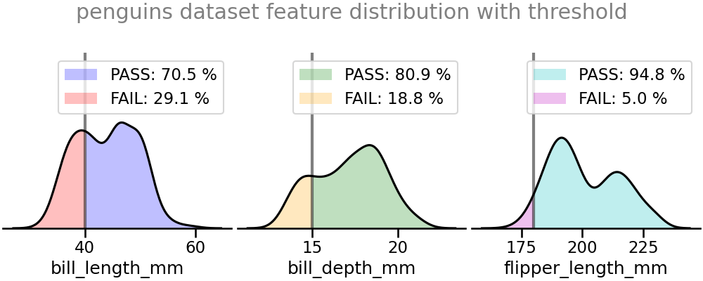
8. 활용 - 펭귄 데이터셋
- 펭귄 데이터셋의 세 수치형 데이터, bill_length, bill_depth, flipper_length에 이 함수를 적용합니다.
plt.subplots(ncols=3)으로 틀을 잡아 놓고 Axes마다 데이터를 threshold와 함께 넣었습니다.
1 | # 데이터셋 읽어오기 |
