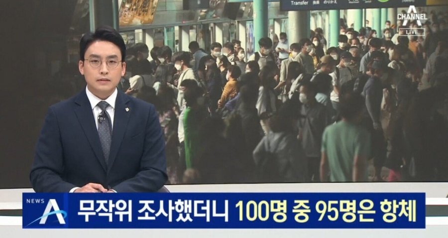
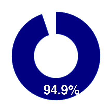
- 최근 무작위 조사 결과 95%의 사람들에게서 코로나19 항체가 발견되었다고 합니다.
- 한 뉴스에서 이 기사가 보도되었는데 시각화가 적절치 못했습니다.
- 이를 나름대로 바로잡아 새로 그려봅니다.
1. 언론 보도
-
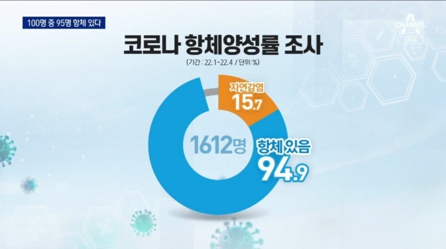
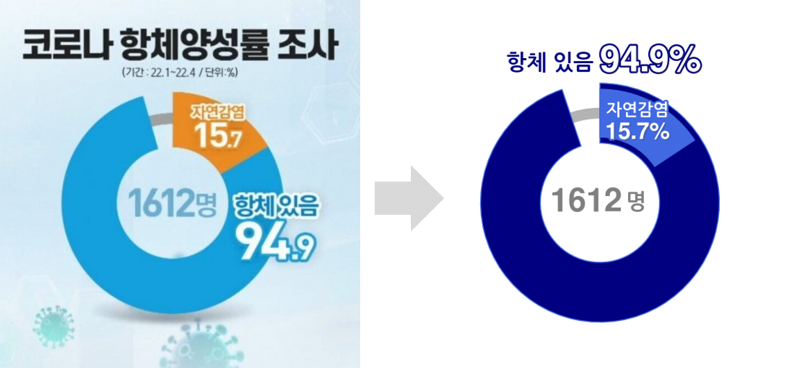
2022년 6월 14일, 1612명을 대상으로 코로나19 항체 보유를 조사한 결과가 보도되었습니다.
-
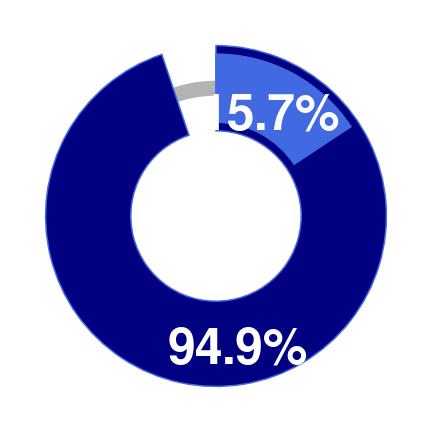
전체의 95%에서 항체가 발견되었고 15.7%는 자연 감염 경력이 있다고 합니다.
-
그런데 문제가 있습니다.
-
자연 감염 15.7%와 항체 보유 94.9%가 나란히 놓이는 바람에 별개의 데이터로 보입니다.
-
심지어 색상을 다르게 사용하는 바람에 정말 다른 종류의 데이터로 느껴집니다.
2. 다시 그리기
- 동명대학교에서의 강의를 계기로 새로 그려보기로 했습니다.
- 사실 당일 새벽에 코드를 급하게 작성했기 때문에 강의를 하다가도 아쉬운 부분이 느껴졌고,
- 한 단계 다시 정리를 하기로 했습니다.
- Google Colab 코드를 다시 정리합니다.
2.1. 환경 설정
- Colab에 기본으로 설정된 폰트가 좀 아쉬워서 외부 폰트를 설치했습니다.
- 초반 Matplotlib 버전 업그레이드와 함께 진행했습니다.
1 | # Step 1. Matplotlib 업그레이드 |
- 라이브러리를 불러오고 환경을 설정합니다.
- 색맹에게도 데이터를 잘 전달할 수 있도록 seaborn의
colorblindpalette를 기본으로 사용합니다. NanumGothic을 기본으로 지정해 그림에 한글을 출력할 수 있도록 합니다.
1 | # Step 4. 라이브러리 호출 |
2.2. 데이터 정리
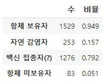
- 그림에서 데이터를 추출합니다.
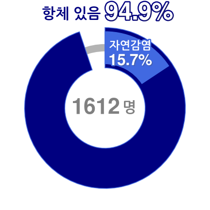
1 | num = 1612 # 조사 대상 수 |
2.2. 항체 보유, 자연 감염 시각화
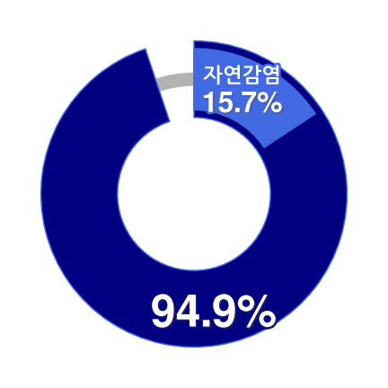
- 항체 보유 94.9% 내에 자연 감염 15.7%를 포함시켜 그리기로 합니다.
- 항체 보유와 미보유만 먼저 그린 후, 항체 미보유는 삭제합니다.
- 해당 wedge와 text를 함께 삭제합니다.
코드 보기/접기
1 | fig, ax = plt.subplots(figsize=(6, 6), constrained_layout=True) |
- 자연 감염, 백신 접종자(?), 항체 미보유자를 기준으로 pie chart를 새로 그리고,
- 자연 감염자를 제외한 나머지를 제거합니다.
코드 보기/접기
1 | fig, ax = plt.subplots(figsize=(6, 6), constrained_layout=True) |

2.3. 항체 미보유자 선 그리기
- 원본과 마찬가지로 항체 미보유자에 선을 그립니다.
- 곡선은 pie chart 뒤에 원을 그려 표현합니다.
코드 보기/접기
1 | from matplotlib.patches import Circle |
2.4. 폰트 위치 및 크기 조정
- 결국 전달하고 싶은 내용은 항체 보유자 94.9%입니다.
- 이 안에 있는 자연 감염 15.7%는 중요한 부차 정보입니다.
- 자연 감염은 폰트 크기를 줄이고, "자연 감염"을 위에 붙입니다.
코드 보기/접기
1 | from matplotlib.patches import Circle |
2.5. 항체 보유자 비율 이동
- 항체 보유자 비율을 상단으로 옮깁니다.
- "항체 있음"을 항체 보유자 비율 앞에 붙입니다.
코드 보기/접기
1 | from matplotlib.patches import Circle |
3. 결론
-
약간의 코딩으로 왼쪽 그림을 오른쪽처럼 바꿨습니다.
-
적어도 자연감염이 94.9% 안에 포함되어 있다는 것은 전달되는 듯 합니다.
-
최선이라고는 생각지 않습니다.
-
지금도 왠지 맘에 쏙 들지는 않지만 나중에 보면 마음에 더 안들지도 모릅니다.
-
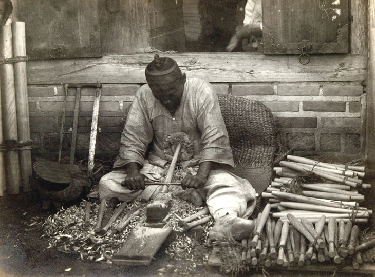
방망이를 깎는 노인의 심정으로 계속 붙들고 싶지만 현실적으로 마감 등 한계가 있습니다.
-
기본기가 튼튼해지면 이런 제약에서도 더 좋은 결과를 낼 수 있을 것 같습니다.
-
오늘도 방망이를 깎습니다. 같은 마음을 가진 모든 분들을 응원합니다.