- 자주 있는 일은 아니지만 3차원 곡면을 그릴 때가 있습니다.
- 어떤 분은 원자를 표현하느라, 또는 쇠구슬을 표현하느라 구가 필요할지도 모릅니다.
- 저는 업무상 태양이 하늘에 떠 있는 지점을 고민할 때가 많아서 반구가 필요합니다.
- 과거에는 원자의 3차원 에너지를 표현하느라 이런 그림이 필요했습니다.
1. 데이터 준비
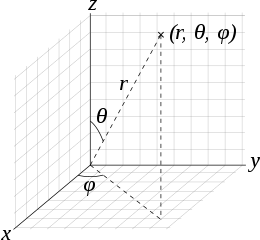
- 구나 반구를 그리려면 구면 좌표계로 정의된 데이터가 필요합니다.
- 간단한 삼각함수를 사용해서 구면 데이터를 만듭니다.
- 방위각(azimuthal angle, $\theta$)과 극고도각(polar angle, $\varphi$)을 나열한 뒤 여기에 아래 수식을 적용합니다.
$$
\begin{aligned}
x &= r \cos{\varphi} \sin{\theta}\\
y &= r \sin{\varphi} \sin{\theta}\\
z &= r \cos{\theta}
\end{aligned}$$
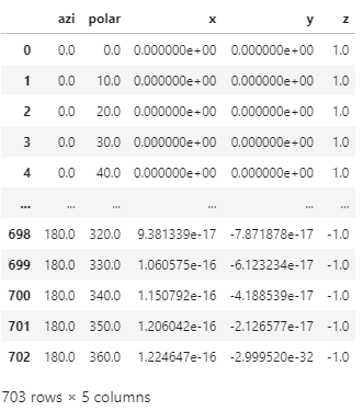
- 코드로는 이렇게 정리됩니다.
1 | # angles |
- 실행 결과
2. 3D 곡면 도형 그리기
matplotlib: 3D surface (colormap)
matplotlib: mpl_toolkits.mplot3d.axes3d.Axes3D
- 주어진 데이터로 만들어지는 3D 표면 형상을 만드는데는
.plot_surface()가 적격입니다. - 앞서 만든 데이터로 구(sphere)와 반구(hemisphere)를 만들어봅시다.
2.1. sphere
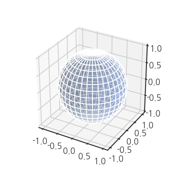
- 우리가 만든 좌표가 이미 구의 좌표입니다.
- 방위각 $\varphi$를 0도에서 360도, 극고도각 $\theta$를 0도에서 180도까지 변화시켰고, 이는 3차원 공간의 모든 방향에 해당되기 때문입니다.
- 그렇다면 남은 일은, DataFrame에 1차원으로 들어있는 각각의 좌표를 차원에 맞게 2차원으로 바꿔주는 것 뿐입니다.
- 극고도각과 방위각의 경우의 수가 각각 19가지, 37가지이므로
.reshape((19, 37)을 적용합니다. - matplotlib은 구면좌표계가 아니라 직교좌표계를 사용합니다. x, y, z로 변환합니다.
1 | fig, ax = plt.subplots(figsize=(5, 5), |
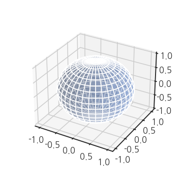
- 구가 그려졌습니다.
- 그런데 z축 방향으로 조금 찌그러져서 납작한 느낌이 나네요.
- aspect ratio를 1:1:1로 맞춰줍시다.
- matplotlib 3차원 Axes(
Axes3D)에서 aspect ratio를 지정하는 명령은.set_box_aspect()입니다.
1 | fig, ax = plt.subplots(figsize=(5, 5), |
2.2. partial sphere
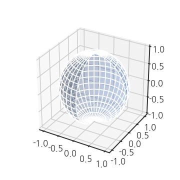
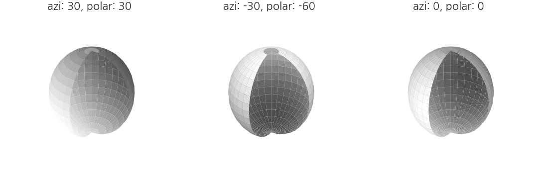
- 극좌표계를 사용해서 구의 일부를 쪼개볼 수도 있습니다.
plot_surface()안에 넣는 x, y, z에다 slicing을 추가하면 됩니다.- 극고도각은 전체 범위를 사용하고 방위각은 마지막 9개를 사용하지 않겠다고 하면 이런 그림이 그려집니다.
1 | fig, ax = plt.subplots(figsize=(5, 5), |
2.3. 선 색깔 조정
- 우리는 지금 면을 그리고 있습니다.
- 따라서
edgecolor(ec),linestyle(ls),linewidth(lw)가 적용됩니다. - 불필요한 axis도 지워버립시다. 명령은 똑같이
ax.axis(False)입니다.
1 | fig, ax = plt.subplots(figsize=(5, 5), |
- 아까보다 한결 깔끔해 보입니다.
2.4. 면 색깔 조정
- 면 색깔을 지정하는 매개변수는
color입니다. colors="g"처럼 색상을 의미하는 약어나 숫자를 넣으면 적용됩니다.
1 | fig, ax = plt.subplots(figsize=(5, 5), |
- 조명 방향도 바꿀 수 있습니다.
matplotlib.colors의LightSource클래스를 사용해 조명 방향을 지정합니다.- 두 개의 인자로 방위각과 극고도각을 도(degree) 단위로 입력합니다.
1 | from matplotlib.colors import LightSource |
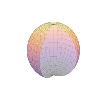
- 멋진 그라데이션을 입히고 싶다면
cmap매개변수를 사용할 수 있습니다. - z축 방향 값에 따른 그라데이션이 매겨집니다.
- Matplotlib이 제공하는 gradation 이름을 집어넣습니다.
- 다만
cmap과lightsource는 함께 쓰일 수 없으니 유의해야 합니다.
1 | fig, ax = plt.subplots(figsize=(5, 5), |
3. 응용
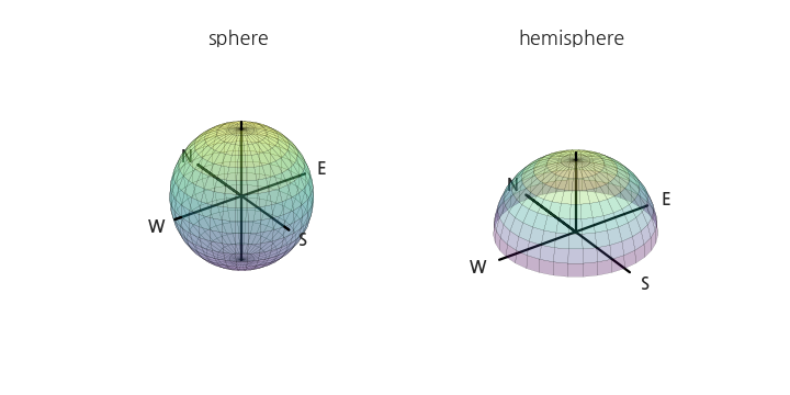
3.1. 구와 반구
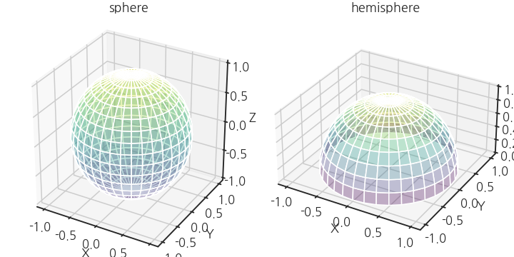
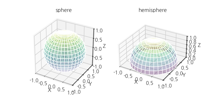
- 구와 반구를 동시에 그려봅니다.
- 구는 위에서 만든 코드를 그대로 사용하면 되고,
- 반구는 극고도각을 절반만 사용하면 됩니다.
1 | fig, axs = plt.subplots(ncols=2, |
- X, Y, Z축 범위가 -1~1을 약간 벗어나 있습니다.
- matplotlib 기본 설정 문제입니다.
- 이를 해결하려면 위 코드에서 fig, axs를 생성한 뒤에 짧은 코드를 추가합니다.
1 | from mpl_toolkits.mplot3d.axis3d import Axis |
- 동서남북, 그리고 상하를 잇는 수직선을 그립니다.
- 좌표 원점이라고 봐도 됩니다.
- 여기서 한 가지 주의할 점이 있습니다.
- matplotlib이 3D 도형과 2D 도형의 위치관계를 깔끔하기 처리하지 못합니다.
- 3D 도형에 가려질 부분과 가려지지 않을 부분을 따로 그리고 표현해줘야 합니다.
- 동서남북을 나타내는 N, E, W, S도 적당한 위치에 넣어줍니다.
1 | fig, axs = plt.subplots(ncols=2, |
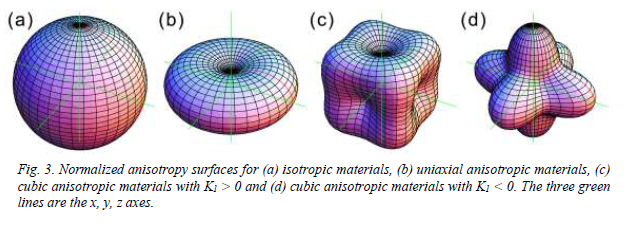
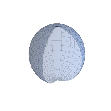
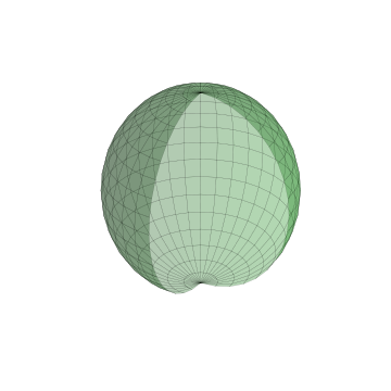
3.2. magnetocrystalline anisotropy
-
결정자기이방성(magnetocrystalline anisotropy)이라는 말을 들어보신 분은 거의 없으실 겁니다.
-
자성(magnetism)을 공부할 때 나오는 용어인데, 방위에 따라 다른 에너지라고 대충 넘어가셔도 좋습니다.
-
중요한 것은 이번엔 구나 반구가 아니라 울퉁불퉁한 모양을 만들 것이라는 점입니다.
-
원리는 간단합니다.
-
이 글의 처음에서 구면좌표계는 다음과 같은 식으로 표현된다고 했습니다.
$$
\begin{aligned}
x &= r \cos{\varphi} \sin{\theta}\\
y &= r \sin{\varphi} \sin{\theta}\\
z &= r \cos{\theta}
\end{aligned}$$
-
앞에서는 $r = 1$로 두었지만, 여기서는 $r = f(\varphi, \theta)$입니다.
-
방위각과 극고도각을 이용해서 물질마다 다르게 r을 정의합니다.
-
모양이 울퉁불퉁한만큼 아까 10도 단위로 쪼갠 공간을 이번엔 5도 단위로 쪼갭니다.
-
자세한 설명은 생략하고 결과 그림과 코드만 간략히 보여드리겠습니다.
-
5도 단위로 공간 분할
1 | # angles |
- 방향에 따른 $r$ 계산: 자기이방성 에너지
1 | # 자기이방성 계수 K1, K2 |
- 세 가지 물질(Co, Fe, Ni)의 자기이방성 에너지 시각화
1 | fig, axs = plt.subplots(ncols=3, |
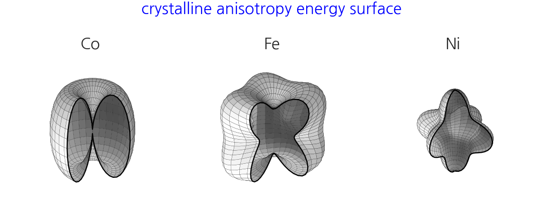
- 제 박사학위 주제와 밀접한 그림입니다.
- 교과서 그림을 모방해 학위논문(2011)에도 같은 그림을 그려서 넣었습니다.
- mathematica를 사용해서 그린 그림입니다.