- Matplotlib으로 3D Plot을 할 수 있습니다.
- 많은 분들이 알고 있는 사실이지만 적극적으로 쓰이지 않습니다.
- 막상 쓰려면 너무 낯설기도 하고 잘 모르기도 하기 때문입니다.
Reference
3. 3D Visualization
- 일반적으로는 x, y축이 있는 2D plot을 만듭니다.
- 간혹 3D plot을 그리려면 x, y, z 세 개의 축이 필요합니다.
- 3D 공간을 만드는 것부터 그림을 그리는 것까지 알아봅시다.
3.1. 3D Axes 만들기
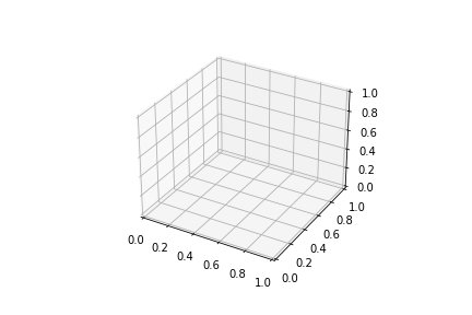
- 3D plot 공식 홈페이지 예제를 보면 대개 이렇게 시작합니다.
1 | from mpl_toolkits.mplot3d import axes3d |
-
위 코드를 입력하면 그림과 같이 비어있는 3D 공간이 생성됩니다.
-
공식 홈페이지에 있는 코드이니만큼 표준 코드겠지만 이상한 점이 있습니다.
-
from mpl_toolkits.mplot3d import axes3d를 했는데,axes3d는 어디 쓴걸까요? -
결론적으로 말씀드리면 사용되지 않았습니다.
-
과거에는 2D는 Axes, 3D는 Axes3D 객체에 따로 담았어야 했습니다.
1 | from mpl_toolkits.mplot3d import Axes3D |
-
Matplotlib 1.0.0 이후 Axes로 통합되었습니다.
-
따라서
fig.add_subplot(projection='3d')만으로 Axes3D를 사용할 수 있는데,projection='3d'를 사용하려면import Axes3D가 필요한 것입니다. -
하지만 이마저도 더이상 필요하지 않습니다.
-
Matplotlib 3.2.0 이후 따로 import하지 않아도
projection='3d'를 사용할 수 있습니다. -
최신 버전은 3.4.2입니다. 가급적 최신 버전을 사용하는 것이 좋습니다.
-
1열 3행의 3D axes를 만든다고 하면, 많은 예제 코드에서 이런 식으로 만듭니다.
1 | fig = plt.figure(figsize=(10, 3)) |

- 그러나 일일이 fig.add_subplot(projection=‘3d’)를 할 필요가 없습니다.
fig, axs = plt.subplot(ncols=3)에 매개변수로subplot_kw={"projection":"3d"}를 추가하면 모든 Axes가 3D로 바뀝니다.
1 | # 2D Axes |
subplot_kw={"projection":"3d"}추가
1 | fig, axs = plt.subplots(ncols=3, figsize=(10, 3), |
3.2. 각도 지정
- 3D plot은 관찰 각도가 중요합니다.
- 관찰 각도에 따라 보이는 모습이 달라지기 때문입니다.
- Matplotlib 3D view 각도는
ax.view_init()명령으로 제어합니다. - 두 개의 3D 공간을 만들고 앙각(elevation angle)과 방위각(azimuthal angle)을 지정합니다.
1 | fig, axs = plt.subplots(ncols=2, figsize=(10, 5), subplot_kw={"projection":"3d"}) |
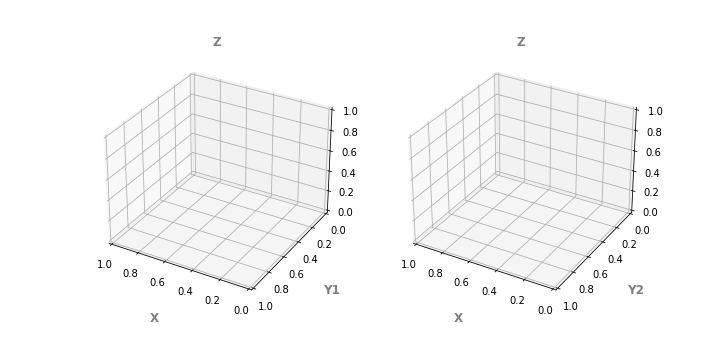
- xlabel, ylabel, title등은 일반적인 2D axes와 동일하게 제어할 수 있습니다.
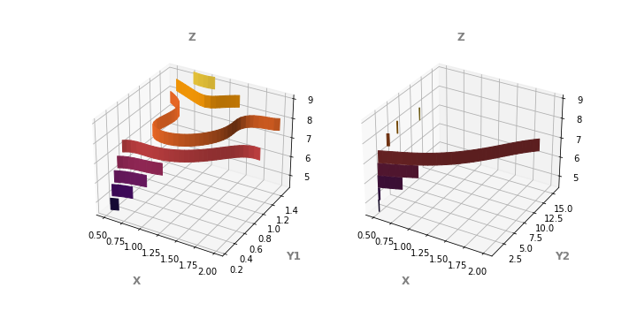
3.3. ax.scatter()
- 3D 공간에서 scatter plot을 그립니다.
- 위 코드에
ax.scatter()를 추가하는 것이 전부입니다.
1 | fig, axs = plt.subplots(ncols=2, figsize=(10, 5), subplot_kw={"projection":"3d"}) |
-
데이터 밀도가 높은 왼쪽 그림에서는 거의 곡면으로 보입니다.
-
그러나 오른쪽 그림은 z가 급격하게 변하기 때문에 사이사이에 빈틈이 많이 보입니다.
-
이런 이유로 scatter plot은 조심해서 사용해야 합니다.
-
3D plot은 2D 화면으로 전달되는데 한계가 있습니다.
-
이를 극복하기 위한 방법 중 가장 좋은 방법 중 하나는 그림을 회전시키는 것입니다.
-
z축을 중심으로 이미지를 회전시키며 한 장 한 장을 담아 동영상으로 출력합니다.
1 | from matplotlib import animation |
- 동영상으로 보니 전체적인 모습이 잘 들어옵니다.
- 앞으로도 비슷한 그림을 동영상으로 만들겠습니다.
- 다만, 코드 구조는 동일하므로 코드는 보이지 않겠습니다.
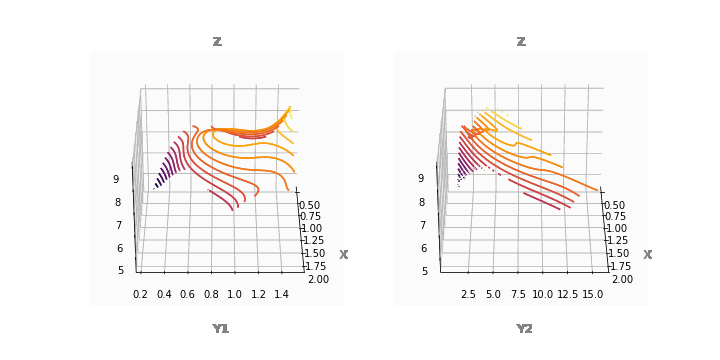
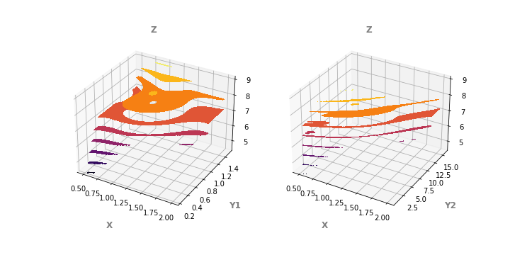
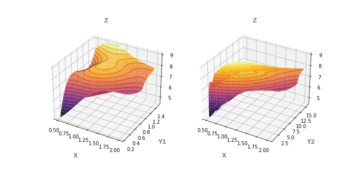
3.4. ax.contour()
- contour plot도 3D로 표현할 수 있습니다.
- 2D와 마찬가지로 데이터 형식을 wide format으로 바꾸어야 합니다.
- wide format으로만 만들어 넣으면 되었던 2D와 달리 X, Y도 필요합니다.
df.pivot_table()로 만든 wide form에서 index와 columns를 떼어 X와 Y를 만듭니다.- 다만 Z와 shape이 같아야 하므로 필요한 수만큼 복사하여 X, Y를 만듭니다.
1 | fig, axs = plt.subplots(ncols=2, figsize=(10, 5), subplot_kw={"projection":"3d"}) |
-
동영상으로도 봅시다.
-
등고선 모양으로 contour plot이 생성되었습니다.
-
scatter plot보다 한결 정돈되어보이기도 하지만 윤곽선이 보이지 않아 아쉽습니다.
-
입체감을 배가시키는 방법으로 등고선을 깊이 방향으로 늘릴 수 있습니다.
-
매개변수에
extend3d=True를 추가합니다.
1 | ax.contour(X, Y, Z, extend3d=True, cmap="inferno") |
- 또는, 깊이에 수직 방향으로 넓게 펼 수 있습니다.
- 이때 명령어는
ax.contour()가 아닌ax.contourf()가 됩니다.
1 | ax.contourf(X, Y, Z, cmap="inferno") |
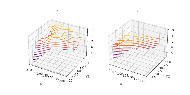
3.5. ax.plot_wireframe()
- Matplotlib 3D plot의 기본 plot이라고 할 수 있는 방식입니다.
1 | # plot_wireframe |
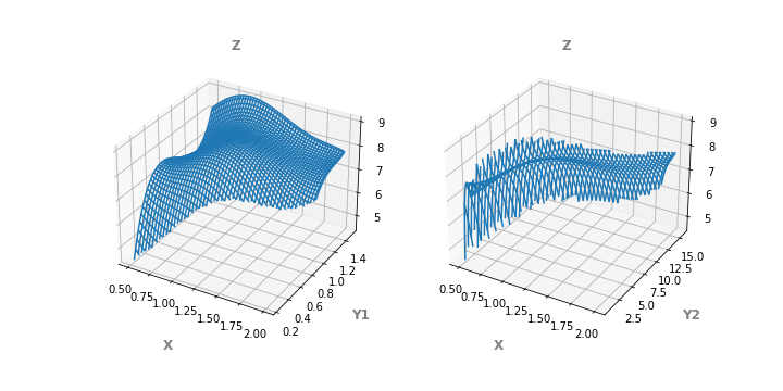
- 데이터끼리 얽힌 wireframe으로 덕에 contour plot에 비해 윤곽선이 잘 드러납니다.
- 그러나 오른쪽 그림처럼 z방향으로 급격하게 변하는 경우 외곽선이 울퉁불퉁합니다.
- 그리고 또 하나,
cmap="inferno"가 작동하지 않습니다. ax.plot_wireframe()에는 색을 입힐 수 없습니다.
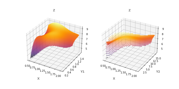
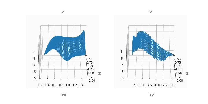
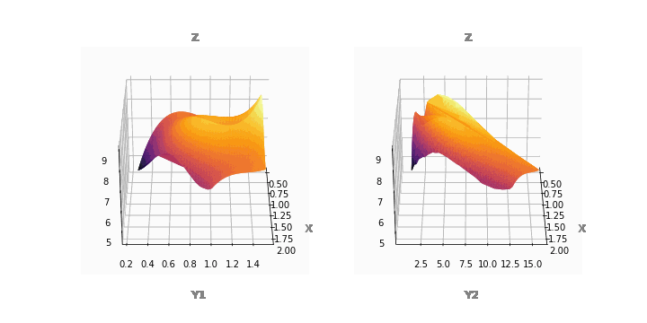
3.6. ax.plot_surface()
-
Matplotlib에는 데이터를 면으로 보여주는
plot_surface()명령이 있습니다.
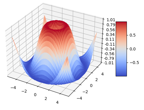
-
3D 데이터를 이어서 면으로 보여주는 명령이기 때문에 매우 유용합니다.
-
제 데이터에도 적절할지 한번 확인해보겠습니다.
-
시각화 코드를
ax.plot_surface()로 교체합니다.
1 | fig, axs = plt.subplots(ncols=2, figsize=(10, 5), subplot_kw={"projection":"3d"}) |
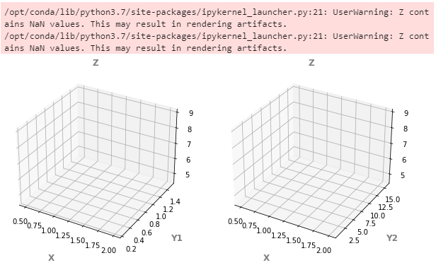
- 어찌된 일인지 아무 일도 발생하지 않습니다.
- 에러 메시지에서 NaN이 문제라고 합니다.
- wide format으로 변형한 Z에 데이터가 포함되어 있지 않은 부분이 문제가 되는 것 같습니다.
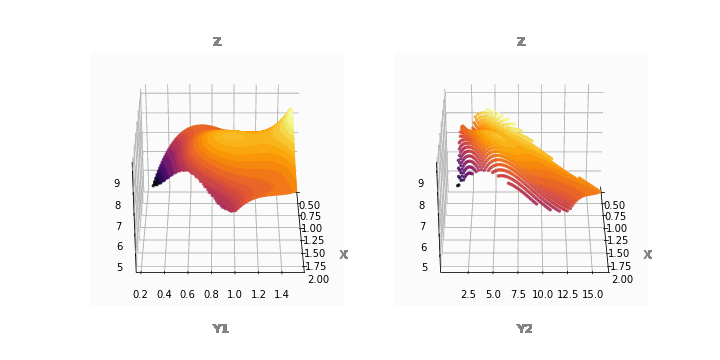
- 이를
numpy.nan_to_num()을 이용해 다른 숫자로 대체합니다.
1 | fig, axs = plt.subplots(ncols=2, figsize=(10, 5), subplot_kw={"projection":"3d"}) |
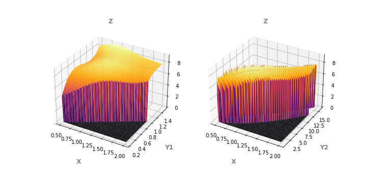
- 존재하지 않는 데이터가 메워지자
ax.contour()가 동작합니다. - 그러나 메워진 값이 진짜 데이터로 오인될 소지가 다분합니다.
- 심지어 메워진 값으로 인해 발생한 옆면의 색이 어지럽습니다. 웬만하면 이러지 맙시다
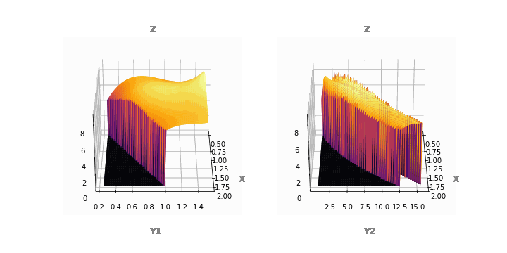
3.7. ax.plot_trisurf()
- 지난 글에서 데이터로 mesh를 만들 수 있다고 했습니다.
- 3D에서도 삼각형 mesh를 만들어 surface를 표현할 수 있습니다.
1 | fig, axs = plt.subplots(ncols=2, figsize=(10, 5), subplot_kw={"projection":"3d"}) |

- 2D에서와 마찬가지로 3D에서도 concave한 지점에 존재하지 않았던 facet이 생깁니다.
- 아쉽기는 하지만 전반적으로 가장 양호합니다.
- mask 매개변수를 익혀서 삭제하는 방법을 알아봐야겠습니다.
3.8. ax.plot_trisurf() + ax.contour()
- 이제까지 살펴본 것 중에서
ax.contour()와ax.plot_trisurf가 가장 쓸모있어보입니다. - 둘을 함께 넣어서 입체적인 그림에 등고선을 추가합니다.
1 | fig, axs = plt.subplots(ncols=2, figsize=(10, 5), subplot_kw={"projection":"3d"}) |

4. 결론
- x, y, z 3축의 데이터를 시각화하는 방법은 여러가지가 있습니다.
- 2D image처럼 표현할 수도 있고, 3D로 울퉁불퉁한 모양을 표현할 수도 있습니다.
- 무엇이 적절할지는 데이터와 프로젝트의 목적, 시각화 목적에 따라 달라집니다.
- 본인에게 적절한 방식을 슬기롭게 선택하시기 바랍니다.
