- Legend(범례)는 데이터의 의미 파악을 도와주는 도구입니다.
- 그러나 그림이 여럿 있을 때 각각 붙은 Legend는 방해가 되기도 합니다.
- Legend를 한데 모아 그리는 방법을 알아봅니다.
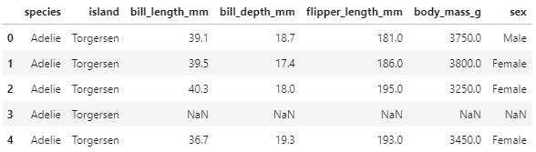
1. Sample Data
- 먼저 필요한 라이브러리들을 불러오고,
1 | %matplotlib inline |
- 우리의 펭귄을 소환합니다.
1 | df_p = sns.load_dataset("penguins") |
2. 기본 그림
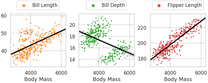
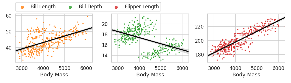
- legend를 붙일 그림을 먼저 그립니다.
- seaborn의
regplot을 사용해서 부리 길이, 폭, 날개 길이를 그립니다. - scatter_kws와 line_kws로 시각화 요소들의 색상, 크기 등을 설정합니다.
1 | fig, axs = plt.subplots(ncols=3, figsize=(10, 4), |
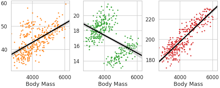
sns.regplot()함수가 데이터 수만큼 반복되고 있습니다.- 데이터 수가 10개라면 코드가 그만큼 더 길어질 것입니다.
- for loop과 zip을 사용해서 효율적으로 바꿉니다. 조금 짧아지고 유지보수가 편해집니다.
1 | fig, axs = plt.subplots(ncols=3, figsize=(10, 4), |

ax.set_ylabel("")로 ylabel을 지웠습니다.- y 인자 이름을 축 레이블 대신 legend 형태로 표현하기 위해서입니다.
3. Legend 하나씩
3.1. Axes별 Legend
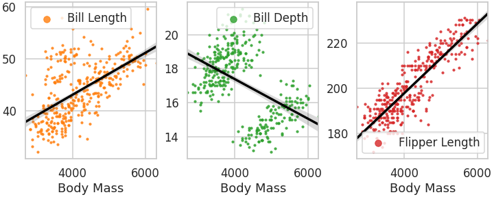
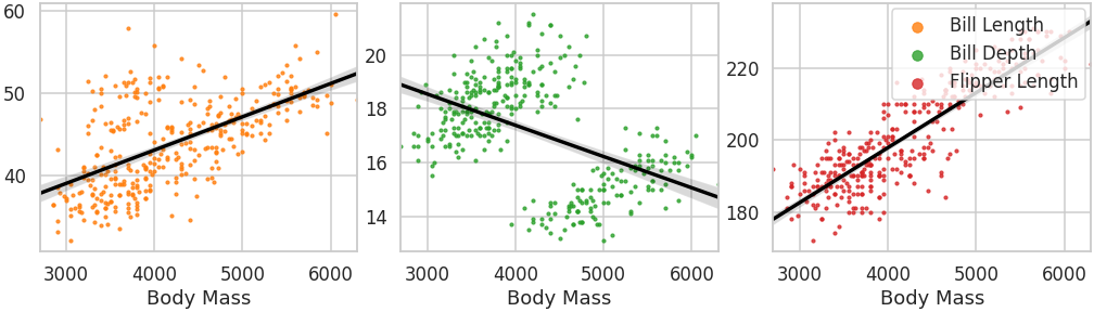
- 가장 기본적인 형태입니다.
- Axes 하나마다
ax.legend()를 실행합니다. - markerscale은 데이터를 의미하는 마커를 3배 크게 그리라는 의미입니다.
- 잘 보이게 하고 데이터와 혼동되지 않게 하려는 의도입니다.
1 | fig, axs = plt.subplots(ncols=3, figsize=(10, 4), |
3.2. Axes 공간 전체 사용
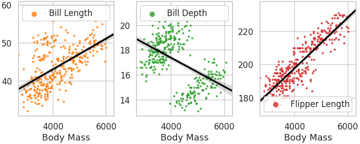
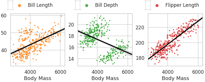
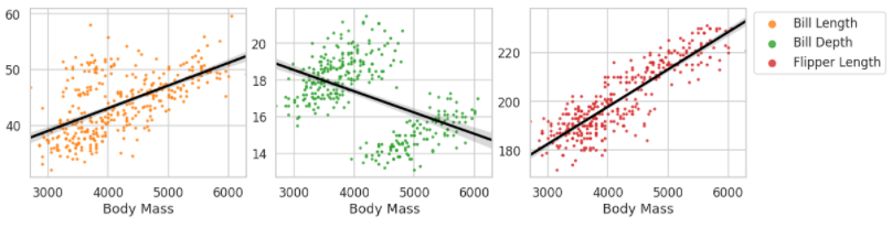
- Axes마다 붙긴 했는데 깔끔하지 않습니다. 좀 지저분합니다.
- Axes마다 Legend가 귀퉁이에 쭈그리고 있어서 그런가 싶습니다.
mode="extend"로 전체 공간을 다 사용하도록 합니다.
1 | fig, axs = plt.subplots(ncols=3, figsize=(10, 4), |
3.3. Axes 위에 Legend
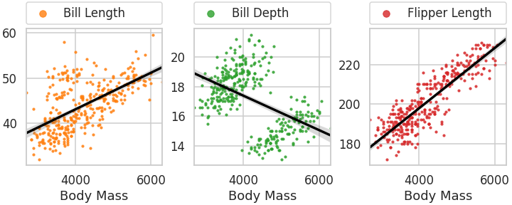
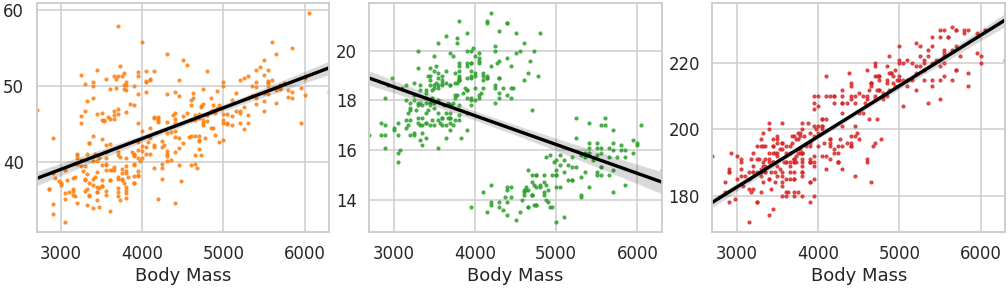
- scatter plot은 점 하나하나가 데이터입니다.
- 시각화 요소들에 의해 가려지면 그만큼 데이터 전달력이 손실됩니다.
- Axes 위로 Legend를 올려서 데이터를 잘 보이게 합니다.
1 | fig, axs = plt.subplots(ncols=3, figsize=(10, 4), |
- 그런데 여기서 전체 범위를 사용하겠다고
mode="extend"를 사용하면 오류가 납니다.
1 | ax.legend(loc="lower center", bbox_to_anchor=[0, 1.03], mode="expand", markerscale=3) |
- 매개변수에서 bbox_to_anchor를 제거하고 사용하면 잘 됩니다.
1 | ax.legend(loc=[0, 1.03], mode="expand", borderaxespad=0, markerscale=3) |
4. Legend 모아 붙이기
-
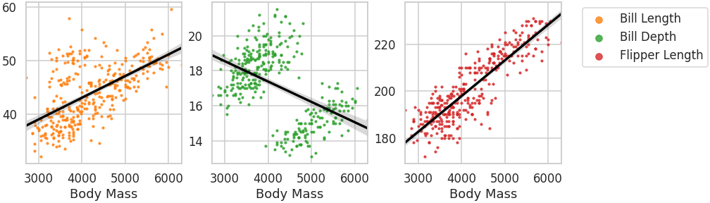
Axes별로 Legend를 출력하지 않고 한데 모으면 더 깔끔합니다.
-
이를 가능하게 하려면 handle과 label이라는 개념을 파악할 필요가 있습니다.
-
legend는 의미가 담긴 label과 label이 지칭하는 대상이 있습니다. 이 대상이 handle입니다.
-
ax.get_legend_handles_labels명령으로 확인하고 가져올 수 있습니다. -
위 그림의 첫번째 Axes에 담긴 handle과 label은 이렇습니다.
1 | handle, label = axs[0].get_legend_handles_labels() |
- 실행 결과: 시각화를 하나밖에 안했으므로 handle과 label이 하나씩입니다.
1 | handle= [<matplotlib.collections.PathCollection object at 0x7f95fa482e90>] |
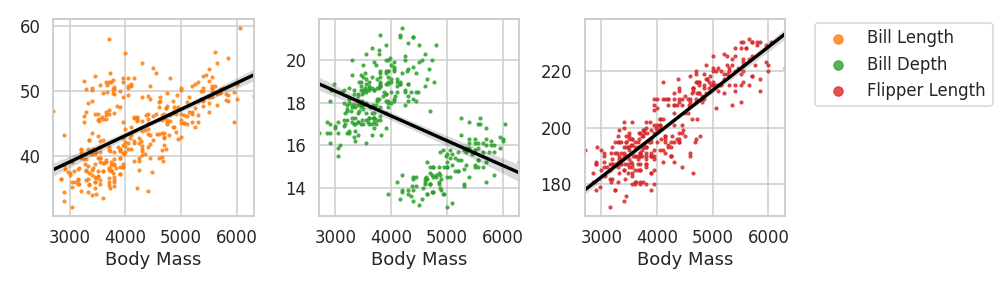
4.1. Axes에 붙이기
- 빈 list를 만들고, 그림을 그릴 때마다 handle과 label을 가져와 모읍니다.
- 그림을 모두 다 그린 후, 맨 마지막 Axes 오른쪽에 붙입니다.
- 추가 공간이 필요하니 그림 가로 폭을 10에서 14로 넓혀줍니다.
1 | fig, axs = plt.subplots(ncols=3, figsize=(14, 4), |
4.2. Figure에 붙이기
- 특정 Axes에 속하지 않도록 전체 그림이 담긴 Figure에 붙일 수 있습니다.
1 | fig, axs = plt.subplots(ncols=3, figsize=(14, 4), |
4.2. Figure의 Axes 옆자리에 붙이기
-
Axes를 그대로 놔두고 붙였더니 맨 우측 Axes에 겹쳐 그려졌습니다.
-
Axes 옆에 놓기 위해 legend의 위치를 섬세하게 지정합니다.
-
loc와 bbox_to_anchor 매개변수는 이런 역할을 합니다.
-
loc만 단독으로 사용하면 붙이는 대상에 따라 Figure나 Axes의 지정된 위치에 놓입니다
-
loc와 bbox_to_anchor를 함께 사용하면 loc는 legend의 지점이 되고 bbox_to_anchor는 legend가 놓일 위치가 됩니다.
-
bbox_to_ancher에 매개변수가 둘 들어가면 위치만, 넷 들어가면 위치와 가로세로 크기입니다.

-
맨 우측 Axes 오른쪽 상단에 붙도록 값을 지정합니다.
1 | fig, axs = plt.subplots(ncols=3, figsize=(14, 4), |
-
화면에는 정상으로 나오지만 파일을 저장하면 그렇지 않습니다.
-
legend가 전혀 보이지 않습니다.
-
bbox_to_anchor에서 지정한 x 위치가 Figure의 우측 한계선(1)을 넘었기 때문입니다.
-
파일 출력을 하려면 legend 전체가 Figure 범위 안에 들어와야 합니다.
-
그러려면 Axes를 좌측으로 압축시킬 필요가 있습니다.
-
fig.tight_layout()에 rect 매개변수를 넣으면 됩니다. -
충돌 방지를 위해 비슷한 기능을 하는 constrained_layout은 figure 생성 명령에서 삭제합니다.
1 | fig, axs = plt.subplots(ncols=3, figsize=(14, 4), sharex=True) |
4.3. Figure의 Axes 위에 붙이기
- 같은 요령으로 legend를 Axes 위에 모아서 붙일 수 있습니다.
1 | fig, axs = plt.subplots(ncols=3, figsize=(14, 4), sharex=True) |
5. 정리
- legend는 여러 데이터를 명확히 구분해주는, 반드시 필요한 요소입니다.
- 그러나 Axes가 많아지고 데이터 인자가 많아질수록 혼돈의 원인이 되기도 합니다.
- 적절한 위치에 적절한 형식으로 배치해서 인지능력 향상에 도움이 되면 좋겠습니다.
