- tight_layout()으로 axes 사이 간격을 적절하게 조정할 수 있습니다.
- subplots, legend와 함께 사용하는 방법을 알아봅시다.
- 간혹 tight_layout()이 잘 안될 때 해결하는 방법도 알아봅시다.
Contributor
데이터짱님, 안수빈님
1. 최종적으로 그릴 그림
이번 글에서, 우리는 이 그림을 그릴겁니다.
포인트는 다음과 같습니다.
- subplot과 눈금 숫자가 겹치지 않게 간격 벌리기
- 범례를 한쪽에 모으기
- 화면에 보이는 대로, 잘리는 부분 없이 파일에 출력하기
- 경고(Warning) 메시지 보이지 않게 하기
2. 예제 그림 만들기
예제로 사용할 그림을 먼저 만듭니다.
이번 글에서는 비슷한 그림이 여러번 반복됩니다.
자칫 지겨울 수 있으니 색상을 랜덤으로 지정합시다.
1
2
3
4
5
6
7
8
9
10
11
12
13
14
15
16
17
18
19
20
21
import matplotlib.pyplot as plt
import numpy as np
# 원(circle) 데이터
t = np.linspace(0, 2*np.pi, 32)
X = 0.5* np.sin(t)
Y = 0.5* np.cos(t)
# Visualization
fig, axes = plt.subplots(ncols=3, nrows=2, figsize=(6, 4))
fig.set_facecolor("lightgray")
axs = axes.ravel()
for i, ax in enumerate(axs, 1):
# 색상 랜덤 지정
R, G, B = np.random.random(), np.random.random(), np.random.random()
color = [R, G, B]
ax.plot(X, Y, "o-", c=color, label=f"plot {i}")
ax.legend()
fig.savefig("45_tightlayout_1.png")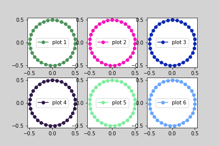
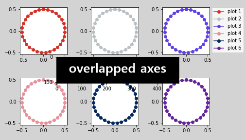
ax.legend()를 사용해서 각 axes마다 범례를 그립니다.
- 원이 들어간 axes 사이의 간격은 적절해 보입니다.
- 문제는 눈금에 붙은 숫자가 다른 axes를 침범하고 있는 것입니다.
- 이 문제를 해결해 보겠습니다.
fig.savefig()는 그림을 파일로 저장하는 코드입니다.- 글을 읽으시는 데 불필요하다고 판단하여 이제까지 대부분 이 줄을 생략했습니다.
- 주피터 노트북에서는 시각화 출력물이 노트북상에 보이기 때문인데,
이번 글에서 화면에 보이는 그림과 저장되는 파일이 다른 경우를 보여드리겠습니다.
fig.set_facecolor()는 figure 색상 지정 명령입니다.- axes가 차지하는 공간을 보여주려고 색을 칠했습니다.
3. 범례 모으기
axes.legend()는 각 axes에 범례를 붙입니다.- 전체를 한번에 모으려면
fig.legend()를 사용합니다.1
2
3
4
5
6
7
8
9
10
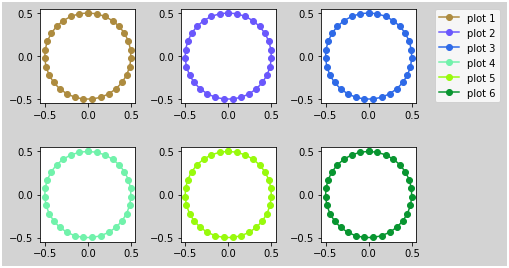
11fig, axes = plt.subplots(ncols=3, nrows=2, figsize=(6, 4))
fig.set_facecolor("lightgray")
axs = axes.ravel()
for i, ax in enumerate(axs, 1):
R, G, B = np.random.random(), np.random.random(), np.random.random()
color = [R, G, B]
ax.plot(X, Y, "o-", c=color, label=f"plot {i}")
fig.legend()
fig.savefig("45_tightlayout_2.png")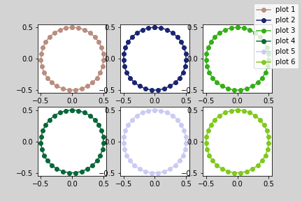
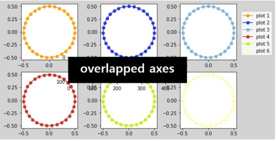
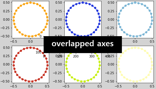
4. axis 사이 간격 벌리기
fig.tight_layout()한 줄을 추가해줌으로써 간격을 적당히 벌릴 수 있습니다.1
2
3
4
5
6
7
8
9
10
11
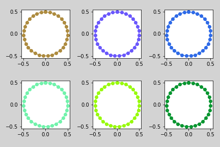
12fig, axes = plt.subplots(ncols=3, nrows=2, figsize=(6, 4))
fig.set_facecolor("lightgray")
axs = axes.ravel()
for i, ax in enumerate(axs, 1):
R, G, B = np.random.random(), np.random.random(), np.random.random()
color = [R, G, B]
ax.plot(X, Y, "o-", c=color, label=f"plot {i}")
fig.legend()
fig.tight_layout() # axes 사이 간격을 적당히 벌려줍니다.
fig.savefig("45_tightlayout_3.png")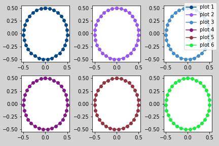
fig.tight_layout()은 axes의 크기를 조정합니다.- 기준은 ticklabels, axis labels, title입니다.
바꾸어 말하면, legend나 suptitle은 고려의 대상이 아닙니다.
- tight_layout으로 인해 그 바람에 axes가 찌그러졌습니다.
- 데이터에 따라 관계가 없을 수도 있지만, 저는 원을 그리고 싶었습니다.
- 데이터 모양을 다시 살려봅니다.
5. axes aspect ratio 맞추기
- axes의 가로세로 비율을 데이터 스케일에 일치시킵니다.
ax.set_aspect("equal")을 사용합니다.1
2
3
4
5
6
7
8
9
10
11
12
13fig, axes = plt.subplots(ncols=3, nrows=2, figsize=(6, 4))
fig.set_facecolor("lightgray")
axs = axes.ravel()
for i, ax in enumerate(axs, 1):
R, G, B = np.random.random(), np.random.random(), np.random.random()
color = [R, G, B]
ax.plot(X, Y, "o-", c=color, label=f"plot {i}")
ax.set_aspect("equal") # 종횡비를 맞춥니다.
fig.legend()
fig.tight_layout()
fig.savefig("45_tightlayout_4.png")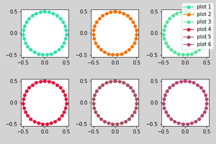
6. legend 옆으로 빼기
- 하나로 모인 legend가 axes 하나를 다 차지하고 있네요.
- 옆으로 빼겠습니다.
legend 이동은
loc와bbox_to_anchor두 인자의 조합으로 이루어집니다.- legend에서 loc가 가리키는 곳을
- 여기서는 “upper left” = 왼쪽 위 귀퉁이
- figure의 어떤 지점에 갖다 붙이라는 의미입니다.
- bbox_to_anchor=(1,0.95) = 오른쪽 위 끄트머리
- legend에서 loc가 가리키는 곳을
적용해 보겠습니다.
1
2
3
4
5
6
7
8
9
10
11
12
13fig, axes = plt.subplots(ncols=3, nrows=2, figsize=(6, 4))
fig.set_facecolor("lightgray")
axs = axes.ravel()
for i, ax in enumerate(axs, 1):
R, G, B = np.random.random(), np.random.random(), np.random.random()
color = [R, G, B]
ax.set_aspect("equal")
ax.plot(X, Y, "o-", c=color, label=f"plot {i}")
fig.legend(loc="upper left", bbox_to_anchor=(1, 0.95)) # legend의 loc와 bbox_to_anchor를 조정합니다.
fig.tight_layout()
fig.savefig("45_tightlayout_5.png")화면에 잘 나옵니다.
그런데 저장된 파일은 이렇습니다.
- 범례의 위치를 bbox_to_anchor=(1,0.95)라고 지정한 것을 상기합시다.
- x 좌표가 figure의 끝자락인 1인데 loc가 upper left로 정의되어 있습니다.
- 다시 말해 figure 오른쪽 경계 너머에 붙이라는 의미라서 안 보이는 게 정상입니다.
- 따라서, 범례까지 저장하려면 그림의 전체 범위를 figure 안쪽으로 잡아야 합니다.
7. 전체 그림 범위 지정하기
fig.tight_layout()의 rect 인자를 조정합니다.- figure 안에 가상의 사각형을 그리고 여기에만 axes를 배열하는 기능입니다.
- rect=[x시작, y시작, x길이, y길이]로 넣어줍니다.
- axes 범위를 조정한 만큼, legend의
bbox_to_anchor도 조정합니다.
- 적용합시다.
1
2
3
4
5
6
7
8
9
10
11
12
13fig, axes = plt.subplots(ncols=3, nrows=2, figsize=(6, 4))
fig.set_facecolor("lightgray")
axs = axes.ravel()
for i, ax in enumerate(axs, 1):
R, G, B = np.random.random(), np.random.random(), np.random.random()
color = [R, G, B]
ax.set_aspect("equal")
ax.plot(X, Y, "o-", c=color, label=f"plot {i}")
fig.legend(loc="upper left", bbox_to_anchor=(0.8, 0.95)) # legend의 loc와 bbox_to_anchor를 다시 조정합니다.
fig.tight_layout(rect=[0, 0, 0.8, 1]) # axes가 표현될 공간을 지정합니다.
fig.savefig("45_tightlayout_6.png")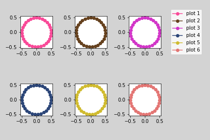
- 화면 출력과 파일 출력이 다시 일치합니다.
- 그런데 그림이 작아졌습니다.
- tight_layout()으로 그림 사이 간격이 넓어지고
- rect 옵션으로 영역 좁아지고
- set_aspect()로 그 안에서 또 종횡비를 맞춘 결과입니다.
8. 그림 크기 재조정
- 그림 크기를 다시 조정해 줍니다.
- 가로를 늘려도 되고, 세로를 줄여도 됩니다.
1
2
3
4
5
6
7
8
9
10
11
12
13
14# figsize를 1 늘려줍니다.
fig, axes = plt.subplots(ncols=3, nrows=2, figsize=(7, 4)) # 크기를 조정합니다.
fig.set_facecolor("lightgray")
axs = axes.ravel()
for i, ax in enumerate(axs, 1):
R, G, B = np.random.random(), np.random.random(), np.random.random()
color = [R, G, B]
ax.set_aspect("equal")
ax.plot(X, Y, "o-", c=color, label=f"plot {i}")
fig.legend(loc="upper left", bbox_to_anchor=(0.8, 0.95))
fig.tight_layout(rect=[0, 0, 0.8, 1])
fig.savefig("45_tightlayout_7.png")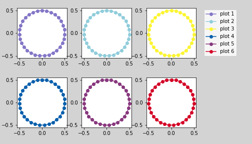
9. fig.add_axes()방식 워터마크 삽입
지난 글에서 워터마크를 넣는 여러 방식을 알아봤습니다.
이 중 fig.add_axes()방식은 아무데나 원하는 크기로 넣을 수 있어서 워터마크 외에도 응용하기 좋습니다.
그런데 오와 열이 맞지 않기 때문에 tight_layout() 입장에서는 처리하기 곤란한 대상입니다.
1
2
3
4
5
6
7
8
9
10
11
12
13
14
15
16
17fig, axes = plt.subplots(ncols=3, nrows=2, figsize=(7, 4))
fig.set_facecolor("lightgray")
axs = axes.ravel()
for i, ax in enumerate(axs, 1):
R, G, B = np.random.random(), np.random.random(), np.random.random()
color = [R, G, B]
ax.set_aspect("equal")
ax.plot(X, Y, "o-", c=color, label=f"plot {i}")
ax_center = fig.add_axes([0.15, 0.1, 0.5, 0.8])
ax_center.imshow(im_wm, alpha=0.3)
ax_center.axis("off")
fig.legend(loc="upper left", bbox_to_anchor=(0.8, 0.95))
fig.tight_layout(rect=[0, 0, 0.8, 1]) # tight_layout에 rect를 적용합니다.
fig.savefig("45_tightlayout_8.png")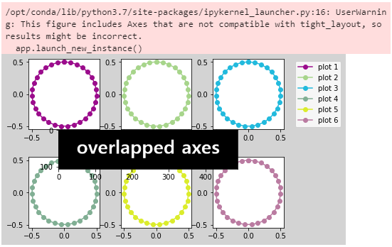
다행히 파일 저장이 무사히 되었습니다.
이번엔 운이 좋았지만 종종 그림이 밀려 어긋나거나 사라집니다.
10. tight_layout()보다 더 강한 constrained_layout
- 아까 tight_layout은 ticklabels, axis labels, title를 본다고 했습니다.
- constrained_layout은 legend, colorbar까지 함께 봅니다.
- matplotlib 내부 연산을 거쳐 딜레이가 있습니다.
- 따라서 real-time visualization에는 적합치 않을 수 있습니다.
- 두 가지 중 한 가지 방식으로 사용할 수 있습니다.
(1) 그림별 설정
지금 만드는 그림에 constrained_layout을 설정합니다.
1 | fig, ax = plt.subplots(constrained_layout=True) |
(2) 기본값 설정
지금 이후 만드는 모든 그림에 설정합니다.
1 | plt.rcParams['figure.constrained_layout.use'] = True |
- tight_layout 대신 constrained_layout을 적용합니다.
1
2
3
4
5
6
7
8
9
10
11
12
13
14
15
16
17fig, axes = plt.subplots(ncols=3, nrows=2, figsize=(7, 4),
constrained_layout=True) # 여기에 적용합니다.
fig.set_facecolor("lightgray")
axs = axes.ravel()
for i, ax in enumerate(axs, 1):
R, G, B = np.random.random(), np.random.random(), np.random.random()
color = [R, G, B]
ax.set_aspect("equal")
ax.plot(X, Y, "o-", c=color, label=f"plot {i}")
ax_center = fig.add_axes([0.23, 0.1, 0.5, 0.8])
ax_center.imshow(im_wm, alpha=0.3)
ax_center.axis("off")
fig.legend(loc="upper left", bbox_to_anchor=(1, 0.95))
fig.savefig("45_tightlayout_9.png") - 화면에 잘 나옵니다.
- 그런데 저장된 파일은 또 이렇습니다.
- 당연한 결과입니다.
- constrained_layout은 tight_layout의 rect같은 인자가 없기 때문입니다.
- 하지만, 부분적으로나마 더 좋은 기능이 있습니다.
10. figure 대신 axes에 범례 달기
- 우리가 만난 문제를 정리해봅시다.
(1) axes 바깥쪽에 범례를 달고 싶음.
(2) 그런데 figure의 범위가 제한되어 있음.
(3) constrained_layout은 웬만한 axes 구성 요소에 맞춰줌
(4) constrained_layout은 figure 구성 요소를 축소하지 못함
어려워 보이지만 해결책이 숨어 있습니다.
- constrained_layout은 figure 범례엔 못 맞춥니다.
- 하지만 ax가 만드는 범례에는 맞춰줍니다
- 따라서, 범례를 axes에 달면 됩니다.
코드를 바꿉니다.
axes들이 만드는 도형을
handles에 모으고, label을labels에 모읍니다.오른쪽 위에 있는 axes[0, 2]에 legend를 답니다.
1
2
3
4
5
6
7
8
9
10
11
12
13
14
15
16
17
18
19
20
21
22fig, axes = plt.subplots(ncols=3, nrows=2, figsize=(7, 4),
constrained_layout=True)
fig.set_facecolor("lightgray")
axs = axes.ravel()
handles = [] # 도형을 여기에 모읍니다.
labels = [] # 레이블을 여기에 모읍니다.
for i, ax in enumerate(axs, 1):
R, G, B = np.random.random(), np.random.random(), np.random.random()
color = [R, G, B]
ax.set_aspect("equal")
handle = ax.plot(X, Y, "o-", c=color, label=f"plot {i}")
handles.append(handle[0]) # 도형을 handles에 넣습니다.
labels.append(f"plot {i}") # label을 labels에 넣습니다.
ax_center = fig.add_axes([0.23, 0.1, 0.5, 0.8])
ax_center.imshow(im_wm, alpha=0.3)
ax_center.axis("off")
# 범례를 여기에 답니다.
axs[2].legend(handles, labels, loc="upper left", bbox_to_anchor=(1, 1.05))
fig.savefig("45_tightlayout_10.png")
- handles와 labels를 따로 만들어 사용하는 점이 복잡해 보이지만,
- 상당한 matplotlib 유발 감정을 해소할 수 있는 기능입니다.
- 조금은 익숙해져 봅시다. :)
