- 자주 사용하는 기능은 함수로 만들면 편리합니다.
- 마찬가지로 자주 그리는 그림은 함수로 만들면 좋습니다.
- Matplotlib 객체지향을 사용해 함수를 만듭시다.
1. Parity plot
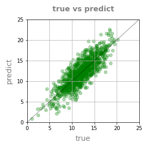
- 머신러닝 후 참값을 x축, 예측값을 y축에 놓고 얼마나 비슷한지 평가하고는 합니다.
- 이런 그림을 parity plot이라고 하며, 매우 자주 그리는 그림입니다.
- 그림이 목적이므로 데이터는 간단히 만듭니다.
1
2
3
4
5
6
7
8
9
10
11
%matplotlib inline
import matplotlib.pyplot as plt
import seaborn as sns
import numpy as np
import pandas as pd
# 샘플 데이터 생성
size = 1000
x = np.random.normal(size=size, loc=12, scale=3)
y = x + np.random.normal(size=size, loc=0, scale=2)
그리고, parity plot은 이렇게 그려집니다.
x가 큰 지점에서는 예측값이 실제값보다 큽니다.
중앙부 기준 중심선에서 5정도 어긋난 듯 합니다.
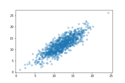
- 많이 본 형태라 당연하게 여길 수 있겠지만 그냥 그리면 이렇습니다.
- 대충 일치하는 것 같기는 합니다.
- 그런데 얼마나 일치하고 얼마나 어긋나는지 잘 모르겠습니다.
1
plt.scatter(x, y, alpha=0.3)
x와 y축의 눈금을 일치시키고, grid와 중심선까지 그었기 때문에 보이는 것입니다.
코드는 이렇습니다.
1
2
3
4
5
6
7
8
9
10
11
12
13
14
15
16
17
18
19
20
21
22
23
24
25
26
27
28
29
30
31
32
33
34
fig, ax = plt.subplots(figsize=(4, 4))
# data plot
ax.scatter(x, y, c="g", alpha=0.3)
# x, y limits
ax.set_xlim(0, 25)
ax.set_ylim(0, 25)
# x, y ticks, ticklabels
ticks = [0, 5, 10, 15, 20, 25]
ax.set_xticks(ticks)
ax.set_xticklabels(ticks)
ax.set_yticks(ticks)
ax.set_yticklabels(ticks)
# grid
ax.grid(True)
# 기준선
ax.plot([0, 25], [0, 25], c="k", alpha=0.3)
# x, y label
font_label = {"color":"gray", "fontsize":"x-large"}
ax.set_xlabel("true", fontdict=font_label, labelpad=8)
ax.set_ylabel("predict", fontdict=font_label, labelpad=8)
# title
font_title = {"color": "gray", "fontsize":"x-large", "fontweight":"bold"}
ax.set_title("true vs predict", fontdict=font_title, pad=16)
# 파일로 저장
fig.tight_layout()
fig.savefig("73_mplfunc_01.png")34줄의 코드를 머신러닝 프로젝트때마다 짤 수는 있겠지만 귀찮습니다.
함수로 만들어 자동화합시다.
2. 함수 만들기
- python에서 함수는
def 함수이름(매개변수):로 선언함으로써 만들어집니다. - 그리고 함수 내부에 parity plot을 그리는 코드를 넣어주면 작동합니다.
- 그렇다면, 함수의 결과물은 무엇으로 하는 게 좋을까요? 매개변수에는 뭘 넣을까요?
- 간단한 예시를 만들며 고민해 봅시다
2.1. plot_sample()
- x, y 데이터를 입력받아 scatter plot을 그리는 함수입니다.
1
2
3
4
5
6
7
8
9
10
11
12
13
14
15
16
17
18
19
20
21
22
23
24
25
26
27
28
29
30
def plot_sample1(x, y, xlabel=None, ylabel=None, title=None, filename=None):
# math fonts
mathtext_fontset = plt.rcParams['mathtext.fontset']
mathtext_default = plt.rcParams['mathtext.default']
plt.rcParams['mathtext.fontset'] = "cm"
plt.rcParams['mathtext.default'] = "it"
# object oriented interface
fig, ax = plt.subplots()
# data plot
ax.scatter(x, y)
# x, y labels
font_label = {"color":"gray", "fontsize":"x-large"}
ax.set_xlabel(xlabel, fontdict=font_label, labelpad=8)
ax.set_ylabel(ylabel, fontdict=font_label, labelpad=8)
# title
font_title = {"color": "darkgreen", "fontsize":"xx-large", "fontweight":"bold"}
ax.set_title(title, fontdict=font_title, pad=16)
# math fonts restoration
plt.rcParams['mathtext.fontset'] = mathtext_fontset
plt.rcParams['mathtext.default'] = mathtext_default
# save figure
fig.tight_layout()
if filename:
fig.savefig(filename)
이 함수에 x와 y 데이터를 입력하면 다음과 같은 그림이 출력됩니다.
함수 내부에서 fontdict를 사용해 xlabel과 ylabel, title 형태를 미리 설정했기 때문에,
별다른 옵션을 지정하지 않았는데도 크기와 색상이 반영되어 있습니다.심지어 LaTeX 입력시 폰트도 roman(정확히는 Computer Modern)으로 설정됩니다.
1
2
3
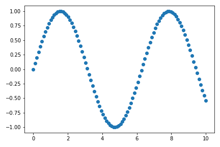
4x_sample = np.linspace(0, 10, 100)
y_sample = np.sin(x_sample)
plot_sample1(x_sample, y_sample, "$X$", "$Y$", "$Y = \mathrm{sin}(X)$")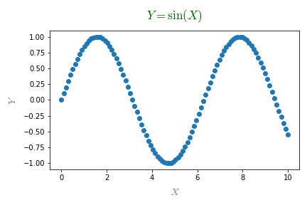
filename=에 적절한 이름을 담아 매개변수로 넣으면 파일 저장까지 자동으로 됩니다.
- 기본값이 지정되면 사용이 편리합니다.
- xlabel, ylabel, title, filename의 기본값 = None으로 지정했기 때문에, 함수의 인자로 x와 y만 입력해도 결과물이 출력됩니다.
2.2. 시각화 유형 변환
- scatter plot 말고 다른 것도 그려봅시다.
- 경우에 따라 line plot을 그리고싶다면 매개변수에 종류가 있으면 됩니다.
- seaborn과 pandas를 따라 이름은 kind로 지정합니다.
생각을 한번만 더 해봅시다.
- matplotlib에 익숙한 이이라면
ax.scatter()가 익숙할 것입니다. - seaborn을 많이 쓰는 사람이라면
sns.scatterplot()이 친숙할 겁니다. - kind=로 전달되는 인자에 scatter가 있기만 하면 scatter plot을 그립시다.
if "scatter" in kind:로 구현할 수 있습니다.- line plot도 비슷하게 구현합니다.
- matplotlib에 익숙한 이이라면
이제부터는 코드가 조금 길어집니다. 시각화 함수 코드는 기본적으로 숨겨두겠습니다.
여기를 클릭하면 보입니다.
plot_sample2()코드 보기/접기1
2
3
4
5
6
7
8
9
10
11
12
13
14
15
16
17
18
19
20
21
22
23
24
25
26
27
28
29
30
31
32
33def plot_sample2(x, y, kind="scatter", xlabel=None, ylabel=None, title=None, filename=None):
# math fonts
mathtext_fontset = plt.rcParams['mathtext.fontset']
mathtext_default = plt.rcParams['mathtext.default']
plt.rcParams['mathtext.fontset'] = "cm"
plt.rcParams['mathtext.default'] = "it"
# object oriented interface
fig, ax = plt.subplots()
# data plot
if "scatter" in kind:
ax.scatter(x, y)
elif "line" in kind:
ax.plot(x, y)
# x, y labels
font_label = {"color":"gray", "fontsize":"x-large"}
ax.set_xlabel(xlabel, fontdict=font_label, labelpad=8)
ax.set_ylabel(ylabel, fontdict=font_label, labelpad=8)
# title
font_title = {"color": "darkgreen", "fontsize":"xx-large", "fontweight":"bold"}
ax.set_title(title, fontdict=font_title, pad=16)
# math fonts restoration
plt.rcParams['mathtext.fontset'] = mathtext_fontset
plt.rcParams['mathtext.default'] = mathtext_default
# save figure
fig.tight_layout()
if filename:
fig.savefig(filename)
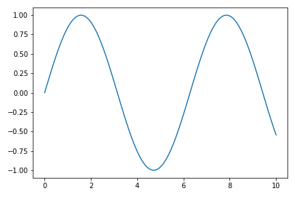
line plot
1
plot_sample2(x_sample, y_sample, kind="line")
scatter plot (지정)
1
plot_sample2(x_sample, y_sample, kind="scatterplot")
scatter plot (기본값)
1
plot_sample2(x_sample, y_sample)

2.3. 유형에 따른 매개변수 입력
- Matplotlib의
plot()명령과scatter()명령은 입력받는 인자가 다릅니다. - 이 인자들을 모두 매개변수로 넣자면 너무 많고 코드 관리가 어렵습니다.
plot()과scatter()에 필요한 매개변수를 각기line_kws과scatter_kws라는 이름의 dictionary 형식으로 입력하게 합시다.
dictionary 형식의 인자는 기본값을 None으로 넣고, 실제 시각화 코드에 **line_kws 형식으로 unpacking하여 입력합니다.
keyword arguments로 None이 들어가면 에러가 나기 때문에 간단한 예외처리를 합니다.
1
2
3
4
5
6
7
8
9
10
11
12
13
14
15
16
17# 함수 선언 부분
def plot_sample3(x, y, kind="scatter", xlabel=None, ylabel=None, title=None,
filename=None, line_kws=None, scatter_kws=None):
#... 전략 ...#
# data plot
if "scatter" in kind:
if not scatter_kws:
scatter_kws={}
ax.scatter(x, y, **scatter_kws)
elif "line" in kind:
if not line_kws:
line_kws={}
ax.plot(x, y, **line_kws)
#... 후략 ...#keyword parameter를 적용한 코드입니다.
plot_sample3()코드 보기/접기1
2
3
4
5
6
7
8
9
10
11
12
13
14
15
16
17
18
19
20
21
22
23
24
25
26
27
28
29
30
31
32
33
34
35
36
37
38def plot_sample3(x, y, kind="scatter", xlabel=None, ylabel=None, title=None,
filename=None, line_kws=None, scatter_kws=None):
# math fonts
mathtext_fontset = plt.rcParams['mathtext.fontset']
mathtext_default = plt.rcParams['mathtext.default']
plt.rcParams['mathtext.fontset'] = "cm"
plt.rcParams['mathtext.default'] = "it"
# object oriented interface
fig, ax = plt.subplots()
# data plot
if "scatter" in kind:
if not scatter_kws:
scatter_kws={}
ax.scatter(x, y, **scatter_kws)
elif "line" in kind:
if not line_kws:
line_kws={}
ax.plot(x, y, **line_kws)
# x, y labels
font_label = {"color":"gray", "fontsize":"x-large"}
ax.set_xlabel(xlabel, fontdict=font_label, labelpad=8)
ax.set_ylabel(ylabel, fontdict=font_label, labelpad=8)
# title
font_title = {"color": "darkgreen", "fontsize":"xx-large", "fontweight":"bold"}
ax.set_title(title, fontdict=font_title, pad=16)
# math fonts restoration
plt.rcParams['mathtext.fontset'] = mathtext_fontset
plt.rcParams['mathtext.default'] = mathtext_default
# save figure
fig.tight_layout()
if filename:
fig.savefig(filename)
- line_kws 적용
1
2
3
4
5plot_sample3(x_sample, y_sample, kind="line",
line_kws={"c":"r", "ls":":", "lw":3})
# "c": "r" - line color = "red"
# "ls": ":" - line style = ......
# "lw": 3 - line width = 3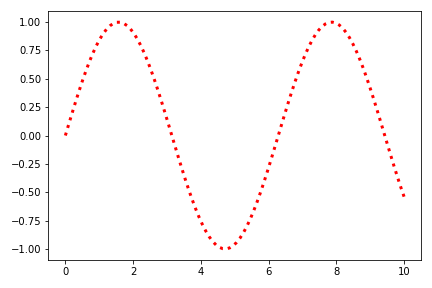
- scatter_kws 적용 : line_kws는 무시됩니다.
1
2
3
4
5
6plot_sample3(x_sample, y_sample, kind="scatter",
line_kws={"c": "r", "ls": ":", "lw": 3},
scatter_kws={"s": 50, "ec": "b", "alpha": 0.2})
# "s": 50 - marker size = 50
# "ec": "b" - marker color = "blue"
# "alpha": 0.2 - marker 불투명도 = 0.2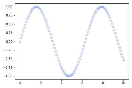
- 이제 웬만한 함수는 원하는대로 만들 수 있습니다.
- 그런데, 한번 만들고 끝일까요?
- 함수를 실행할 때는 title을 달지 않았는데, 나중에 달고 싶지 않을까요?
- 그럴 때 return이 유용합니다.
2.4. Axes as return
- matplotlib의 구성요소인 axes를 return 시키면 많은 것이 가능합니다.
- 먼저, 기존의 코드에
return ax만 추가하고 실행해 봅니다.plot_sample4()코드 보기/접기1
2
3
4
5
6
7
8
9
10
11
12
13
14
15
16
17
18
19
20
21
22
23
24
25
26
27
28
29
30
31
32
33
34
35
36
37
38
39
40
41def plot_sample4(x, y, kind="scatter", xlabel=None, ylabel=None, title=None,
filename=None, line_kws=None, scatter_kws=None):
# math fonts
mathtext_fontset = plt.rcParams['mathtext.fontset']
mathtext_default = plt.rcParams['mathtext.default']
plt.rcParams['mathtext.fontset'] = "cm"
plt.rcParams['mathtext.default'] = "it"
# object oriented interface
fig, ax = plt.subplots()
# data plot
if "scatter" in kind:
if not scatter_kws:
scatter_kws={}
ax.scatter(x, y, **scatter_kws)
elif "line" in kind:
if not line_kws:
line_kws={}
ax.plot(x, y, **line_kws)
# x, y labels
font_label = {"color":"gray", "fontsize":"x-large"}
ax.set_xlabel(xlabel, fontdict=font_label, labelpad=8)
ax.set_ylabel(ylabel, fontdict=font_label, labelpad=8)
# title
font_title = {"color": "darkgreen", "fontsize":"xx-large", "fontweight":"bold"}
ax.set_title(title, fontdict=font_title, pad=16)
# math fonts restoration
plt.rcParams['mathtext.fontset'] = mathtext_fontset
plt.rcParams['mathtext.default'] = mathtext_default
# save figure
fig.tight_layout()
if filename:
fig.savefig(filename)
# return
return ax
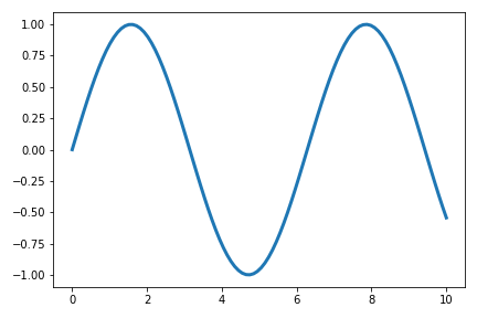
- line plot을 그립니다.
- return된 axes에는 방금 그린 그림의 정보가 모두 포함되어 있습니다.
1
ax = plot_sample4(x_sample, y_sample, kind="line", line_kws={"lw":3})
- axes에 xlabel, ylabel, title을 추가할 수 있습니다.
- plot 추가도 가능합니다. 코드도 일반적인 시각화와 동일합니다.
- 심지어 순차적으로 적용되는 line color도 그냥 그리는 그림과 같습니다.
- 당연합니다. 객체지향 방식이니까요 :)
1
2
3
4
5
6
7
8
9
10# xlabel, ylabel, title 추가
ax.set_xlabel("xlabel (postprocess)")
ax.set_ylabel("ylabel (postprocess)")
ax.set_title("title (postprocess)")
# plot 추가
ax.plot(x_sample+1, y_sample)
# jupyter cell에서 시각화
display(ax.figure)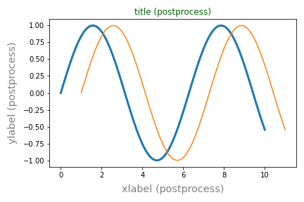
※ 주의 ※
- 그러나 자세히 보면 x, y label에는 설정된 값들이 제대로 적용되지만 title에는 색상만 적용됩니다.
- title=None일 때 matplotlib axes가 담는 정보가 불충분한 것으로 생각됩니다.
2.5. Axes as input
- axes는 함수의 입력 매개변수로 작용할 때 그 진가를 발합니다.
- 함수는 복잡한 명령을 한번에 실행한다는 장점이 있지만 유연성이 부족합니다.
- 날코딩은 유연성이 풍족하지만 일일이 코딩하기 번잡합니다.
- 이 둘을 섞을 수 있는 방법이 axes를 input으로 받는 것입니다.
머신러닝 예측결과 시각화로 예를 들어보겠습니다.
- parity plot은 실제값과 예측값을 비교하는 그림입니다.
- trainset, validation set, testset 세 데이터 모두에 대해 그릴 수 있습니다.
- 이 중 하나만 그릴 때도 있고 둘만, 셋 다 그릴 때가 있습니다.
- 이 때마다 함수를 일일이 만든다면 몹시 번거로울 것입니다.
이럴 때 이런 해법을 만들 수 있습니다.
plt.subplots()등으로 필요한 수만큼 Axes을 만듭니다.- 준비된 함수로 각각의 Axes에 parity plot을 그립니다
- 그러자면, 함수로 그려질 그림이 어디에 그려질지 지정되어야 합니다.
- 매개변수로 axes를 받으면 가능합니다.
- axes가 지정되지 않으면 스스로 figure를 만들도록 합니다. 이 때 figure size도 인자로 넣읍시다.
- 파일로 저장하려면 figure 객체가 필요합니다. figure 객체는 axes 입력이 없을 때만 존재하니 예외처리를 합니다.
1
2
3
4
5
6
7
8
9
10
11
12
13
14
15
16
17
18
19
20def plot_sample5(x, y, kind="scatter", xlabel=None, ylabel=None, title=None,
filename=None, line_kws=None, scatter_kws=None,
figsize=plt.rcParams['figure.figsize'], ax=None):
#... 전략 ...#
# object oriented interface
if not ax:
fig, ax = plt.subplots(figsize=figsize)
#... 후략 ...#
# save figure
if not ax:
fig.tight_layout()
if filename:
fig.savefig(filename)
# return
return axplot_sample5()코드 보기/접기1
2
3
4
5
6
7
8
9
10
11
12
13
14
15
16
17
18
19
20
21
22
23
24
25
26
27
28
29
30
31
32
33
34
35
36
37
38
39
40
41
42
43
44def plot_sample5(x, y, kind="scatter", xlabel=None, ylabel=None, title=None,
filename=None, line_kws=None, scatter_kws=None,
figsize=plt.rcParams['figure.figsize'], ax=None):
# math fonts
mathtext_fontset = plt.rcParams['mathtext.fontset']
mathtext_default = plt.rcParams['mathtext.default']
plt.rcParams['mathtext.fontset'] = "cm"
plt.rcParams['mathtext.default'] = "it"
# object oriented interface
if not ax:
fig, ax = plt.subplots(figsize=figsize)
# data plot
if "scatter" in kind:
if not scatter_kws:
scatter_kws={}
ax.scatter(x, y, **scatter_kws)
elif "line" in kind:
if not line_kws:
line_kws={}
ax.plot(x, y, **line_kws)
# x, y labels
font_label = {"color":"gray", "fontsize":"x-large"}
ax.set_xlabel(xlabel, fontdict=font_label, labelpad=8)
ax.set_ylabel(ylabel, fontdict=font_label, labelpad=8)
# title
font_title = {"color": "darkgreen", "fontsize":"xx-large", "fontweight":"bold"}
ax.set_title(title, fontdict=font_title, pad=16)
# math fonts restoration
plt.rcParams['mathtext.fontset'] = mathtext_fontset
plt.rcParams['mathtext.default'] = mathtext_default
# save figure
if not ax:
fig.tight_layout()
if filename:
fig.savefig(filename)
# return
return ax
- 그냥 그리기
1
plot_sample5(x_sample, y_sample)

- subplots 안에 넣기
1
2
3
4
5
6
7
8
9
10
11
12
13
14
15
16
17fig, axs = plt.subplots(ncols=2, figsize=(8, 4), sharey=True)
font_title = {"fontweight":"bold", "fontsize":"x-large"}
# 왼쪽 axes
plot_sample5(x_sample, y_sample, ax=axs[0])
plot_sample5(10-x_sample, y_sample, ax=axs[0])
axs[0].set_title("plot 1", fontdict=font_title)
# 오른쪽 axes
plot_sample5(x_sample, -y_sample, kind="line", line_kws={"c": "r"}, ax=axs[1])
plot_sample5(x_sample, 1-y_sample, kind="line", line_kws={"c": "g"}, ax=axs[1])
axs[1].set_title("plot 1", fontdict=font_title)
# 그림 저장
fig.tight_layout()
fig.savefig("73_mplfunc_09.png")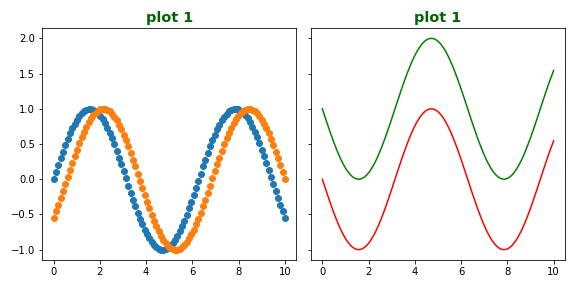
- 새로 그린 그림이
plt.subplots()로 만든 axes에 정확히 담겼습니다. - 그 뿐 아니라 sharey=True 와 같은 axes간 제약조건도 적용됩니다.
- 함수의 문법이 어디선가 본 것 같다고 생각하셨으면 맞게 본 것입니다.
- seaborn의 함수들이 바로 이렇게 만들어졌고 작동합니다.
3. parity plot
- 다시 parity plot으로 돌아갑니다.
- 아래는 제가 만든 함수로 그린 parity plot들입니다.
- 다양한 경우에 활용할 수 있음을 알 수 있습니다.
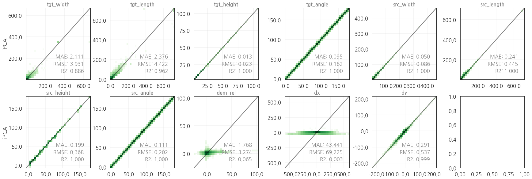
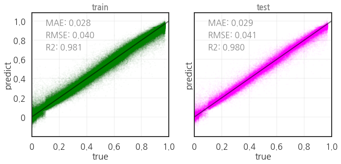
- 코드입니다. 세 가지 지표를 평가하여 그림에 함께 담습니다.
1
2
3
4
5
6
7
8
9
10
11
12
13
14
15
16
17
18
19
20
21
22
23
24
25
26
27
28
29
30
31
32
33
34
35
36
37
38
39
40
41
42
43
44
45
46
47
48
49
50
51
52
53
54
55
56
57
58
59
60
61
62
63
64
65
66
67
68
69
70
71
72
73
74
75
76
77
78
79
80
81
82
83
84
85
86
87
88
89
90
91
92
93
94
95
96
97
98
99
100
101
102
103import seaborn as sns
import matplotlib.colors as colors
from sklearn.metrics import mean_absolute_error
from sklearn.metrics import mean_squared_error
from sklearn.metrics import r2_score
def get_metrics(true, predict):
mae = mean_absolute_error(true, predict)
rmse = mean_squared_error(true, predict, squared=False)
r2 = r2_score(true, predict)
return mae, rmse, r2
def plot_parity(true, pred, kind="scatter",
xlabel="true", ylabel="predict", title="true vs predict",
hist2d_kws=None, scatter_kws=None, kde_kws=None,
equal=True, metrics=True, metrics_position="lower right",
figsize=(4, 4), ax=None, filename=None):
if not ax:
fig, ax = plt.subplots(figsize=figsize)
# data range
val_min = min(true.min(), pred.min())
val_max = max(true.max(), pred.max())
# data plot
if "scatter" in kind:
if not scatter_kws:
scatter_kws={'color':'green', 'alpha':0.5}
ax.scatter(true, pred, **scatter_kws)
elif "hist2d" in kind:
if not hist2d_kws:
hist2d_kws={'cmap':'Greens', 'vmin':1}
ax.hist2d(true, pred, **hist2d_kws)
elif "kde" in kind:
if not kde_kws:
kde_kws={'cmap':'viridis', 'levels':5}
sns.kdeplot(x=true, y=pred, **kde_kws, ax=ax)
# x, y bounds
xbounds = ax.get_xbound()
ybounds = ax.get_ybound()
max_bounds = [min(xbounds[0], ybounds[0]), max(xbounds[1], ybounds[1])]
ax.set_xlim(max_bounds)
ax.set_ylim(max_bounds)
# x, y ticks, ticklabels
ticks = [int(y) for y in ax.get_yticks() if (10*y)%10 == 0]
ax.set_xticks(ticks)
ax.set_xticklabels(ticks)
ax.set_yticks(ticks)
ax.set_yticklabels(ticks)
# grid
ax.grid(True)
# 기준선
ax.plot(max_bounds, max_bounds, c="k", alpha=0.3)
# x, y label
font_label = {"color":"gray", "fontsize":"x-large"}
ax.set_xlabel(xlabel, fontdict=font_label, labelpad=8)
ax.set_ylabel(ylabel, fontdict=font_label, labelpad=8)
# title
font_title = {"color": "gray", "fontsize":"x-large", "fontweight":"bold"}
ax.set_title(title, fontdict=font_title, pad=16)
# metrics
if metrics:
rmse = mean_squared_error(true, pred, squared=False)
mae = mean_absolute_error(true, pred)
r2 = r2_score(true, pred)
font_metrics = {'color':'k', 'fontsize':12}
if metrics_position == "lower right":
text_pos_x = 0.98
text_pos_y = 0.3
ha = "right"
elif metrics_position == "upper left":
text_pos_x = 0.1
text_pos_y = 0.9
ha = "left"
else:
text_pos_x, text_pos_y = text_position
ha = "left"
ax.text(text_pos_x, text_pos_y, f"RMSE = {rmse:.3f}",
transform=ax.transAxes, fontdict=font_metrics, ha=ha)
ax.text(text_pos_x, text_pos_y-0.1, f"MAE = {mae:.3f}",
transform=ax.transAxes, fontdict=font_metrics, ha=ha)
ax.text(text_pos_x, text_pos_y-0.2, f"R2 = {r2:.3f}",
transform=ax.transAxes, fontdict=font_metrics, ha=ha)
# 파일로 저장
if not ax:
fig.tight_layout()
if filename:
fig.savefig(filename)
return ax
